Data Analysis with QGIS#
🚧This training platform and the entire content is under ⚠️construction⚠️ and may not be shared or published! 🚧
Competences:
This module covers how to perform general data analysis, calculate statistics, create buffers, produce heatmaps, and divide rivers, roads, or areas into segments. The following modules will cover more complicated data analysis methods.
Data & Spatial Analysis#
Even with a single layer, extensive analysis is possible. However, often the information we need to analyse is spread across multiple layers. To gain these insights, we use the spatial and non-spatial GIS processing tools we learned in previous modules. In this module, we will explore how to apply these tools, collect and work with data, and create meaningful insights. We will also review several examples of data analysis commonly used in humanitarian work.
Spatial analysis#
Fig. 164 Spatial analysis means using multiple layers to gain new insights#
A spatial analysis can be a result of combining several layers with different information in a single map.
Geographic analysis helps us answer questions like:
What patterns are in the data?
How can we summarise any trends?
What’s nearby?
Which areas are affected?
What’s inside or outside a boundary?
How do phenomenon change with location?
How do locations change over time?
Before doing any sort of processing, you need to familiarise yourself with the data and understand it.
The first step is to read the metadata from the source and understand what data was collected, who collected the data, and how the data was collected.
Next, open the attribute table and look at the different features and attributes available. What do the attributes show and what are they called?
Now you can start visualising the data:
You can visualise the data cartographically by assigning or categorising the data using symbols
You can create charts from the attribute table
You can look for patterns, averages, outliers
We are often seeking ways to describe our data to an audience. Sometimes, spatial analysis will be used to provide recommendations for activities. Given the vast amount of data available online, it is important to take a step back and gain perspective on this knowledge, these capabilities, and the data itself before rushing to manipulate it:
Reliability: Can I trust this data?
Interest: Do I need this data?
Usage: Am I able to use this data?
Comprehensiveness: Is this data complete?
Date: How old is this data?
Sensitivity: Is this data sensitive?
With spatial analysis, you can build predictive models to plan ahead of disasters. HOWEVER: Not all analysis is complicated! Just knowing how many features are in a layer is useful. Simple data analysis includes:
Ranking
Categorising
Above/below threshold
Affected Areas
Population distribution
It is important to know the limitations of the data at your disposal - don’t try to use unsuitable data for analysis (e.g. if you now a survey sample is not representative)
Attention
Spatial Representation and Analysis There are some spatial analysis problems that are difficult to avoid completely. For example the Modifiable Areal Unit Problem, where the results look different depending on the unit of analysis.
There are two main types of data analysis:
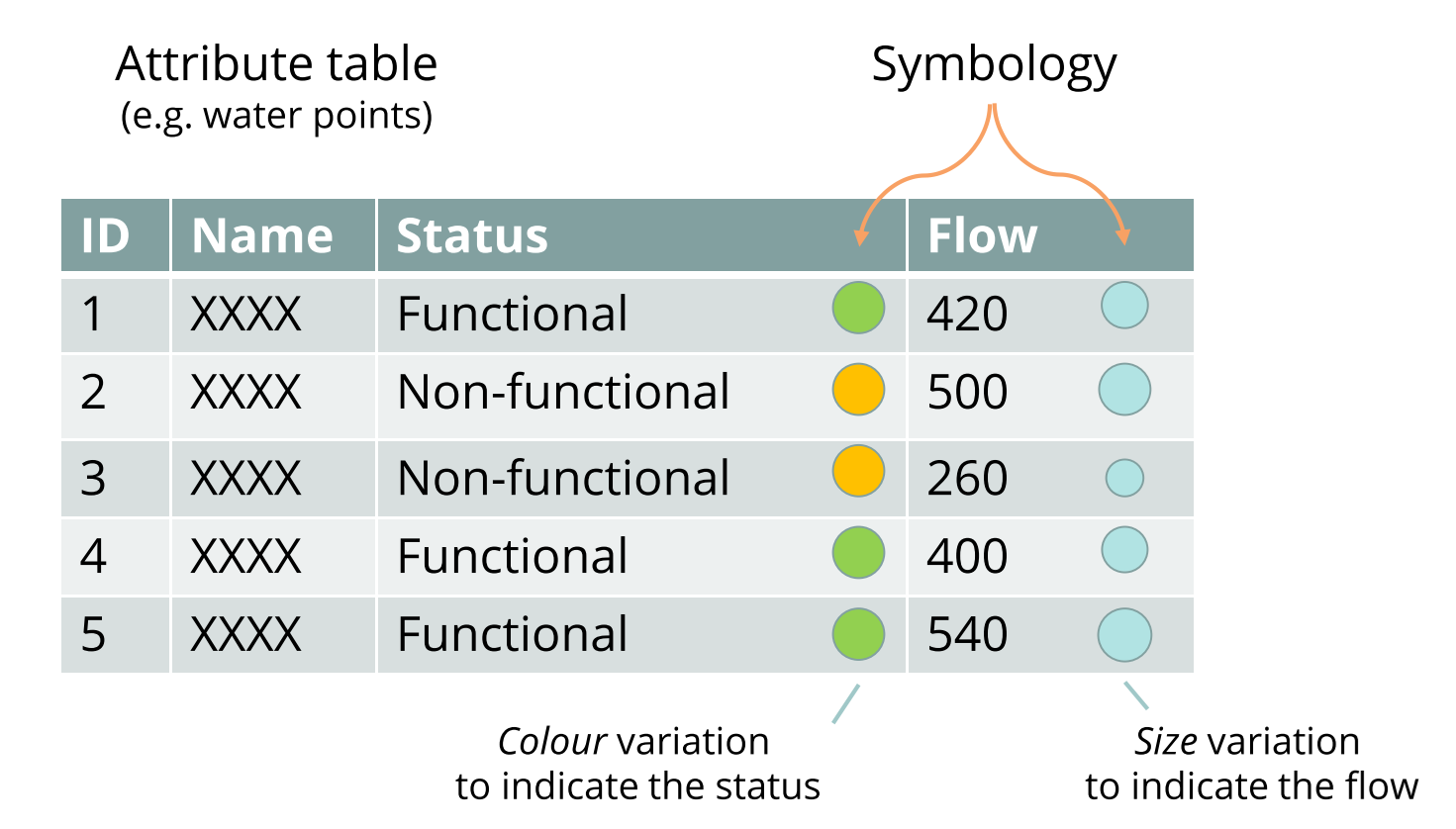
Fig. 165 Assigning visual variables to different attributes is already an analysis#
Thematic analyses focus on visual variation according to a given attribute of the data (one of its characteristics). They are performed on a specific field of the attribute table for the layer, whether textual or numerical. The graphical representation (symbology) changes according to the attribute.
For instance: variations in size depending on population numbers in a refugee camp area.
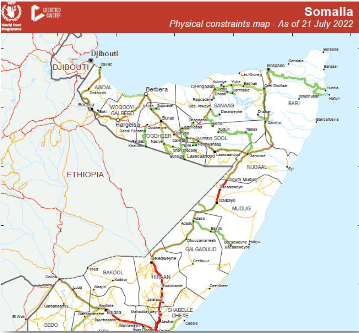
Fig. 166 Thematic analysis using different colours for the roads to discern health accessibility (Source: UNHCR)#
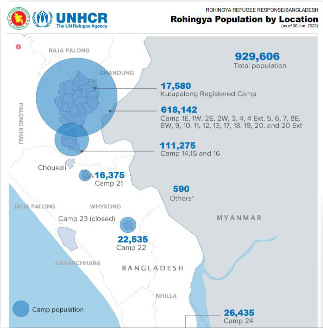
Fig. 167 Thematic analysis using different sizes to distinguish the population number in each camp (Source: WFP)#
Spatial analyses are performed on spatialised phenomena such as: presence/absence of the phenomenon, its relationship with other phenomena or entities, distribution in space. They are performed on the geometry and position of elements, as well as on their relationship with other elements. Spatial analyses can create new values or elements.
For example: crossing two satellite images to extract flooded areas between two dates; or crossing latrine and water catchment areas in a refugee camp; using a digital elevation model to determine which buildings have a high flooding risk.
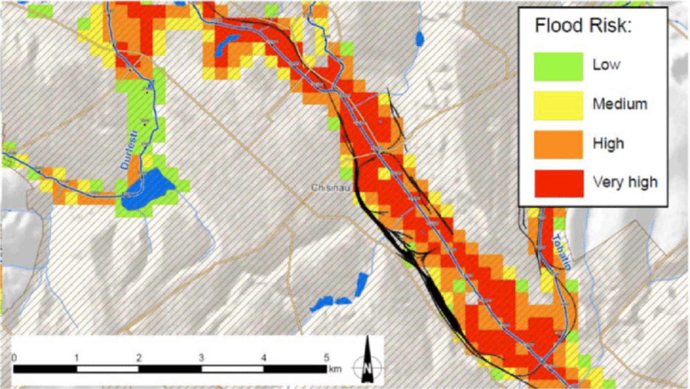
Fig. 168 Example of a flood risk map. Source: Frank, Enrico & Ramsbottom, David & Avanzi, Agostino. (2016). Flood risk assessment and prioritisation of measures: Two key tools in the development of a national programme of flood risk management measures in Moldova. International Journal of Safety and Security Engineering. 6. 475-484. 10.2495/SAFE-V6-N3-475-484.#
Length, Surface, Circumference#
Simply knowing the size of an area or the length of a road section is valuable information. For example, you can determine how much of a road network is inaccessible or how much area is affected by flooding.
These geometrical attributes can be calculated using the field calculator or the processing tool “Add geometry attributes”.
The field calculators has the following functions to calculate geometry attributes as new fields in the attribute table:
Function |
Description |
|---|---|
|
Returns the area of the current feature. The area calculated by this function respects both the current project’s ellipsoid setting and area unit settings. |
|
Returns the length of a linestring. If you need the length of a border of a polygon, use $perimeter instead. The length calculated by this function respects both the current project’s ellipsoid setting and distance unit settings. |
|
Returns the perimeter length of the current feature. The perimeter calculated by this function respects both the current project’s ellipsoid setting and distance unit settings. |
For example, to calculate the area of polygons:
Open the attribute table
Open the field calculator
Check the box
Create a new fieldEnter a
Output field name: “Area”Select the
Output field type: In this case we want a number with decimals. So we select either “decimal number”.Enter
$Areainto the expression window.Select
OK.
In the attribute table, you will find a new column called Area with the respective area for each feature.
Note
The unit of measurement of the calculated area depends on the distance unit settings of the current project’s CRS (metrical or geographic). In most cases you want metres or kilometers. Make sure the units of your CRS are metres to get the correct values.
You can check this by opening the CRS selector (in the bottom right corner) and reading the information of your selected CRS.
Example: Calculating the length of roads
Basic statistics#
In the field calculator, we can calculate the length, area, perimeter for each feature of a dataset. However, we might want to have aggregate statistics on a dataset (average length/area, total length/area).
QGIS comes with two basic processing tools to generate statistics:
Processing tool |
Description |
|---|---|
“Basic statistics for fields” |
This algorithm generates basic statistics (count, sum, mean, median, standard deviation, quartiles, …) from the analysis of a values in a field in the attribute table of a vector layer. Numeric, date, time and string fields are supported. The statistics returned will depend on the field type. Statistics are generated as an HTML file. |
“Statistics by categories” |
This algorithm calculates statistics of fields depending on a parent class. In the option |
Example: Statistics by categories
In this example we have a road network which has been intersected with a flood extent. A new field (“Flood”) has been calculated containing information whether the road is flooded or not (Y=flooded, N=not flooded). The length of each road has been calculated using the $length function in the field calculator as new column called “Length”.
We want to calculate the total length of flooded and unflooded road respectively.
Open the “Statistics by category”-tool
Select the road network layer.
Under
Field to calculate statistics on, selectLengthUnder
Field(s) with categories, selectFloodSpecify a location to save the statistics file.
Click
RunAfter completion, a new layer will appear in your layer tab. This will not contain spatial attributes and is a simple attribute table with the statistics. In our case, we will have the basic statistics (min, max, range, sum, median, sd, etc.) for all the road features with the flooding value “Y”, and “N”.
Tip
You can add a table of the statistics to your print layout by using the “Add attribute table” tool in the print layout composer
Insert statistics examples
Buffer analysis#
Creating a buffer is a helpful analysis to determine what lies in proximity of, for example, a contaminated water source or other hazards and determine vulnerability. Buffer analysis is often used to map the riparian zones along rivers to devise environmental protection zones or estimate vulnerability.
Proximity analysis
Estimated vulnerability analysis
Density Map Analysis#
Density maps are very useful in communicating the intensity of a phenomenon in an area. Point data is spatially aggregated to show the amount of incidents in that area. For example, number of schools or number of disease cases.
It is important to consider that most demographic or economic data needs to be normalised (e.g. number of inhabitants). To assess the significance of the number of schools, you will need to know how the population of the area; so the amount of schools per 1,000 inhabitants, or the number of disease cases per 100 persons, for example.
There are a few different types of density maps. The most common are heatmaps and hexagon grid maps. In both cases, the intensity of a phenomenon is calculated with point data (rarely with lines or polygons).
discrete vs. continuous?
Heatmaps#
Heat maps use features in a dataset to calculate the relative density of points on a map. The density is displayed as a colour ramp with colours ranging from “cool” (low density) to “hot” (high density). Heatmaps are useful when you have a large number of features covering an area with areas where these features cluster together and help us visualise spatial patterns of a layer.
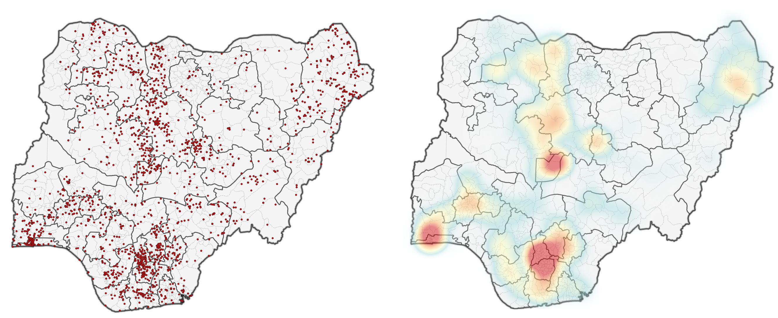
Fig. 169 Example of a point map (left) to a heat map (right)#
To create a heatmap you first need a layer containing data points or ‘samples’. These points are distributed in an area with some areas containing more than others. The density of the points in space determines the intensity of the colour on the heat map.
In QGIS, there are two methods to create heatmaps. The first method uses the symbology tab and is generally a lot faster. The second method uses the interpolation tool “Heatmap (Kernel Density Estimation)” and offers more parameters to adjust. The advantage of the processing tool is that you can set a radius using metric units (for example the number of points in a 100 Meters radius compared to using the millimetres or pixels of your computer screen) and set a variable radius that is determined by another attribute. The next section discusses the creation of heatmaps using the symbology tab.
insert link
Using the symbology tab to create a heatmap#
You can create a heatmap in the symbology tab of a point or polyline layer. Navigate to the symbology tab and select the Heatmap symbolisation method. Here, you can adjust the colour ramp, radius, and maximum value. The radius (in millimetres on your screen) determines the size of the circle that is used to aggregate the points. If it gets bigger more points can be aggregated and the ‘heat’ increases. The maximum value determines the value that is given the ‘hottest’ colour. By default, it is set to the highest number of aggregated points. For example, you can set a threshold above which everything has the “hottest” colour. Reducing it changes the visualisation drastically.
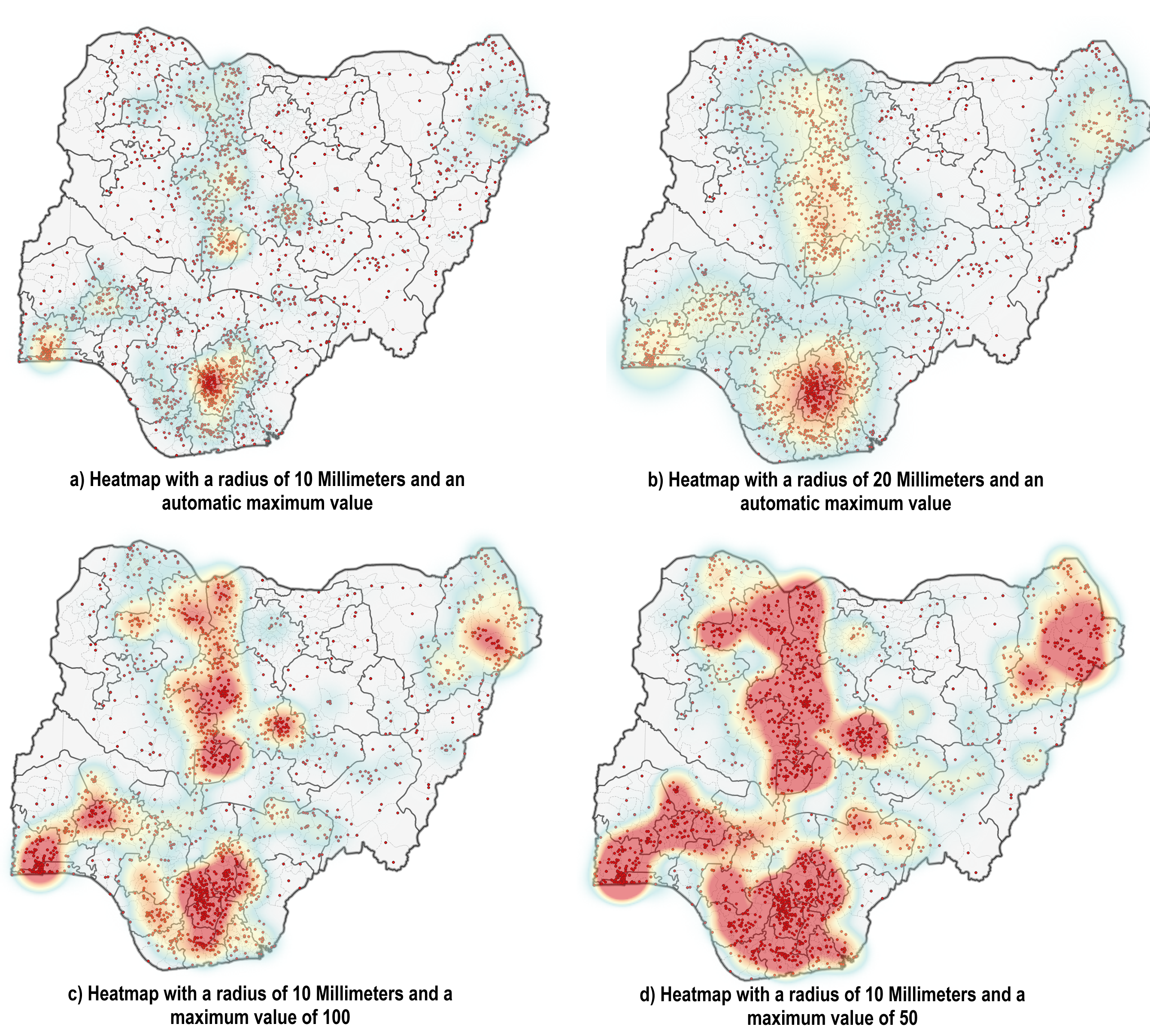
Fig. 170 Examples of heatmaps with different configurations for the radius and the maximum value.#
As you can see, the information communicated through the different maps changes drastically. This is why you need to be transparent on what parameters you have set to create the heatmap.
Assigning a weight to the samples
Assigning weight to sample points can be useful when your dataset has additional information (such as the type of incident, or sampled amount of rainfall) and you want to integrate this information into your heatmap.
Hex Maps (Hexagon Grids)#
Hexagon grids are used to aggregate point incidents in order to normalise geographic data or to mitigate the modifiable area unit problem (problems arising from using irregular shaped polygons). In GIS, we commonly use rectangles (e.g. raster data) or hexagons, as these geometries can be repeat in an evenly spaced grid without leaving gaps.
The advantage of using hexagons is that it is a polygon that closely resembles a circle (where the distance to the centre is equal at every point along the outline), but still leaves no gaps when placed as a grid. This means that it is also possible to use absolute values (no normalisation), since the spatial units have the same size.
Another advantage is that you can use the hexagon grid as spatial units and combine multiple variables (for example, number of incidents per population size) or calculate indexes.
WIKI: Hexagon grids are especially useful for density maps. For example, the number of conflict events or water points in an area.
To create a hexagon grid map, you will first need to create a hexagon grid, by using the “Create Grid” vector tool.
Next, you will need to join the point data with the hexagon grid. We want to know the amount of points that are inside of a hexagon cell. To count the number of points, we need to use the vector tool “Count points in polygon”. The result will be a hexagonal grid where each polygon has the a value for the number of points in that area.
The final step will be to visualise the data by assigning a graduated symbology to the polygons. You can play around with the transparency of your layers to make more information visible.
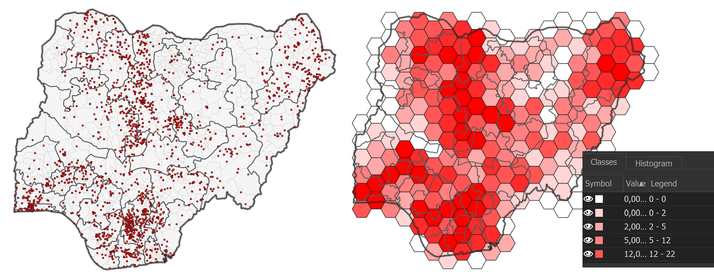
Fig. 171 Point map (left) to hex map (right)#
Example video: Creating a hex map
Create a Hexagon grid with the tool “Create Grid”.
Select
Hexagon (Polygon)as Grid type.The Grid extent should be set to the layer/area of interest.
Select the horizontal and vertical spacing according to the scale of your map.
Optional: Remove the unnecessary Polygons.
Use the tool “Count points in Polygon” to add an attribute field with the number of points that are inside each hexagon cell. The Polygons field should be your reference layer. The new layer will have an attribute field called “NUMPOINTS”
Assign a graduated symbology to the
Count-layer. Select “NUMPOINTS” as the value and categorise the classes as you wish.
Tip
You can remove the hexagon cells that are not overlapping with the reference layer:
Select by location all the cells that intersect with your reference polygon/layer.
Invert the selection.
Delete the selected hexagon cells.
Save the changes you made to the layer.
Analysis by joining attributes#
Joining datasets is a common and useful way to get new insights by adding the information of one table to the other, taking into account key attributes that are used to identify the features that are to be joined. For example: the population size of a district is in one table, and the number of hospitals in a district is in a second table and you wish to combine the two tables to know how many hospitals per population size are in the respective districts.
You have two separate data tables with information you wish to aggregate (join);
Both tables share key identifiers;
CNTY_NAMEin this exampleThe key identifiers serve as the relationship between the two tables
The tables will be combined via the key identifiers
Joining tables will create a new table where the attribute values are added to the key identifiers
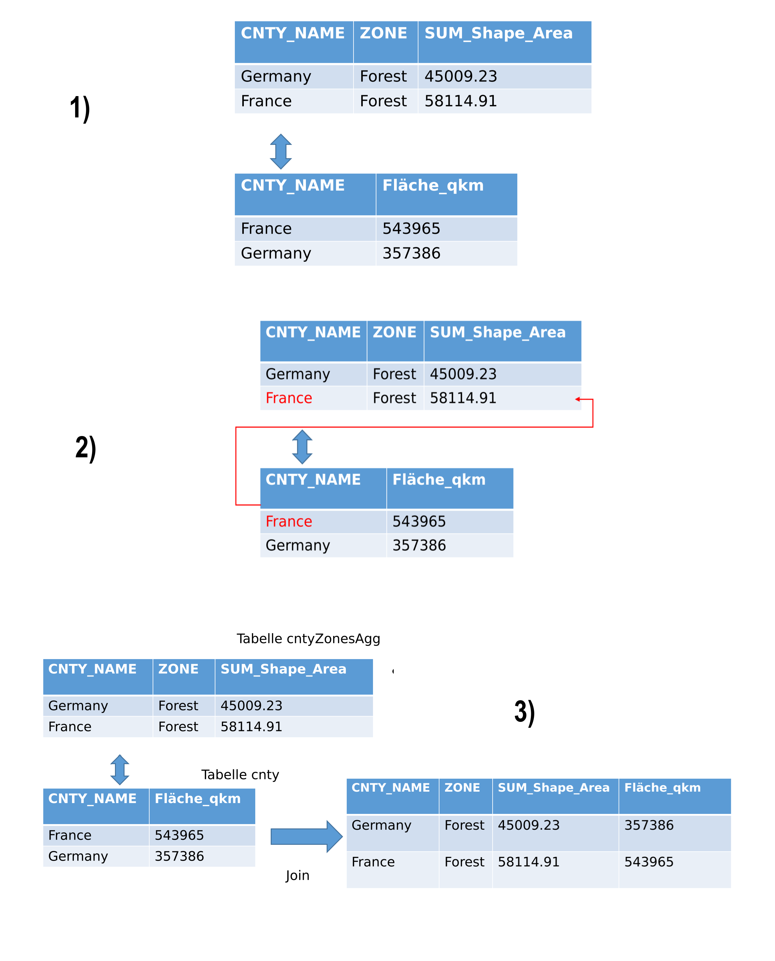
Fig. 172 Table aggregation workflow#
Pivoting tables#
Sometimes, the tables are not in a suitable format for joining. For example, having multiple zones per country makes the CNTRY_NAME field unsuitable for aggregation. In such cases, pivoting the table is useful. This involves aggregating the fields for the zones and their respective area sizes under the country. The values in the ZONE column will be transformed into columns containing the area values. This way, you can aggregate this table with additional information that includes data on countries.
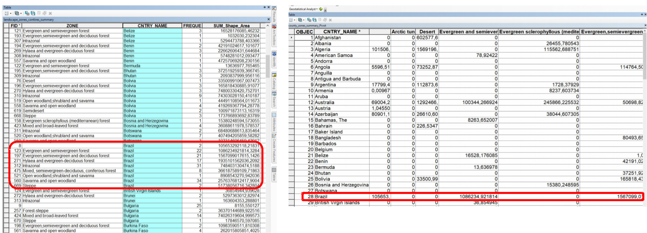
Fig. 173 Pivoting tables means transforming values into columns#
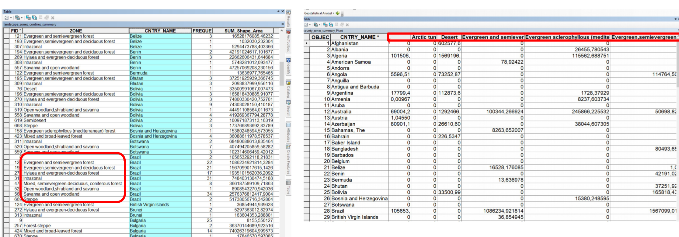
Fig. 174 Values of the column ZONE are transformed into columns#
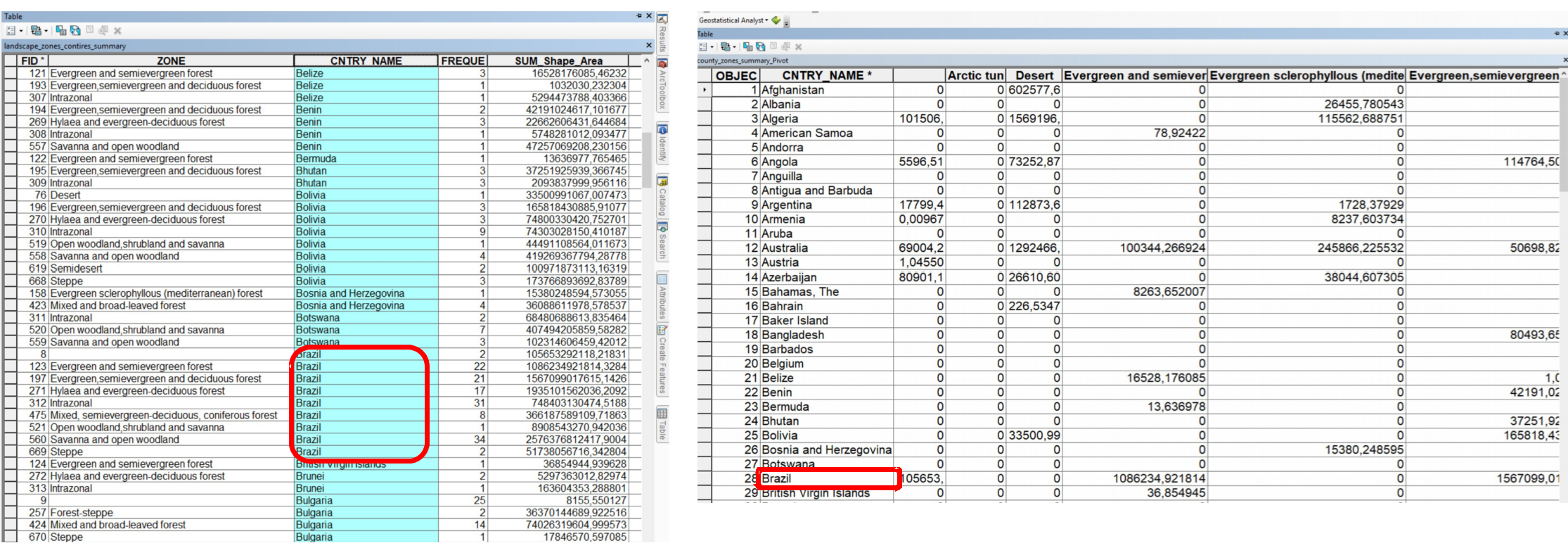
Fig. 175 A country is now represented in a single row#
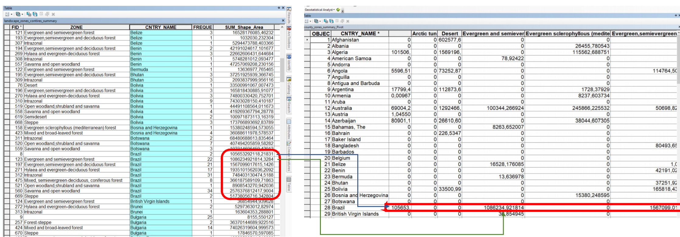
Fig. 176 The values for the areas are added to the country column#
Fig. 177 Red = Pivot field; Blue = Input field; Green = Values field#
Selecting appropriate locations according to a set of criteria#
Interpolation#
insert links
Spatial interpolation uses point data to estimate values at other unknown points. This is extremely useful for spatial phenomena that are continuous, such as rainfall or temperature. For example, you have point data of the temperatures at weather stations, but you want to estimate the temperatures in between these points. Spatial Interpolation can estimate the temperature in between those points. This form of interpolation is called a statistical surface. Interpolation can be used to calculate missing elevation data, precipitation, snow accumulation, water table, and population density.
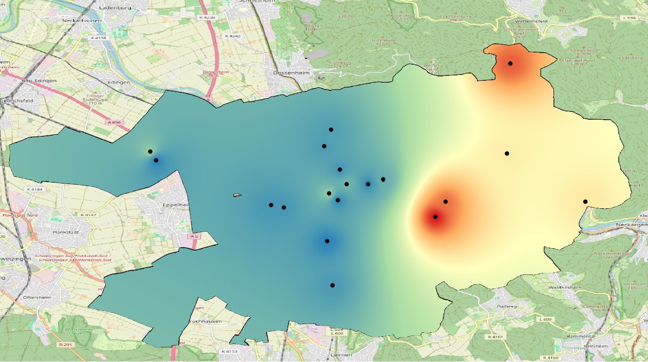
Fig. 178 Temperature map interpolated from weather stations in Heidelberg, Germany using IDW-interpolation.#
Interpolating data can be highly useful since an extensive data collection is costly and rarely possible. Data collection for continuous phenomena is usually conducted only at a small number of locations. Interpolation models use these points to calculate a raster surface with estimated values for each raster cell.
There are many different interpolation methods, each suited for another type of phenomenon or able to take into account different characteristics. In GIS, the most commonly used interpolation methods are Spline interpolation, Inverse Distance Weighted Interpolation (IDW), and Kriging. In the following subchapters, we will take a look at these methods, and discuss their strengths and shortcomings.
Note
Remember that there is no interpolation method that can be applied to every situation. Some methods are more useful for particular problems or types of data. The method of interpolation you use should always depend on the type of data, phenomenon, and research question you have.
IDW Interpolation (Inverse Distance Weighted)#
In the IDW interpolation method, the distance between a sample point and the point to be calculated determines how much the sample point’s value influences the unknown point’s value. A weighting coefficient is assigned to sample points, dictating how their influence decreases with increasing distance. The farther away a known sample point is, the less it influences the point being calculated.
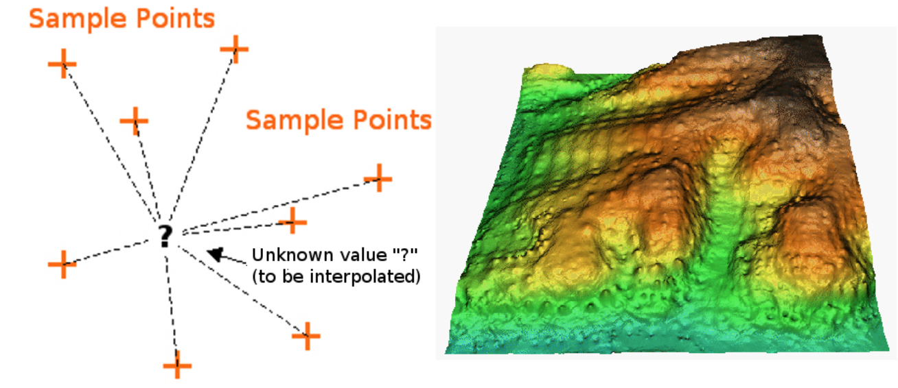
Fig. 179 Inverse Distance Weighted interpolation based on weighted sample point distance (left). Interpolated IDW surface from elevation vector points (right). (Source: Mitas, L., Mitasova, H. (1999). Spatial Interpolation. In: P.Longley, M.F. Goodchild, D.J. Maguire, D.W.Rhind (Eds.), Geographical Information Systems: Principles, Techniques, Management and Applications, Wiley.)#
Keep in mind that IDW interpolation has a few disadvantages. For example, the quality of the calculated statistical surface decreases, if the distribution of sample points is uneven. Additionally, the highest and lowest values in the interpolated surface only occur at sample points, which is probably not the case in the real world. This often results in peaks or pits around the sample data points (see IDW interpolation example) (adopted from the QGIS documentation).
Spline Interpolation#
Triangulated Irregular Network#
TIN interpolation is commonly called Delauny triangulation. This interpolation methods creates a triangular surface with its nearest neighbour points. In order to achieve this, circles are added around known sample points and the intersection of these circles are used as corners of the triangle (see [figure]). TIN interpolation is usually used to compute digital elevation models (DEM).

Fig. 180 Delaunay triangulation with circumcircles around the red sample data. The resulting interpolated TIN surface created from elevation vector points is shown on the right. (Source: Mitas, L., Mitasova, H. (1999). Spatial Interpolation. In: P.Longley, M.F. Goodchild, D.J. Maguire, D.W.Rhind (Eds.), Geographical Information Systems: Principles, Techniques, Management and Applications, Wiley)#
The problem with TIN statistical surfaces is that the surfaces are not smooth and may seem jagged, since they are based on triangles of varying sizes. Furthermore, triangulation is no suited to extrapolate data beyond the area where sample points have been collected (adopted from the QGIS documentation)
Kriging#
Kriging is a method of geostatistics used to estimate values for spatial units where the phenomenon of interest has not been measured at every spatial points. Kriging integrates covariates into the interpolation. For example, it is not only the distance to measured temperatures that influences its weighting; temperature is also influenced by the altitude of the sample point.
Outlook#
There are many analysis methods in GIS. However, setting up an analysis method can be quite time consuming, and creating a new analysis method for every research question makes it hard to compare the results of different analyses. This is why model building and automation are used frequently when working with GIS data. A model can be seen as a analysis blueprint that only needs input data to perform a certain type of analysis. Since the parameters are the same and similar datasets are needed for the model to work properly, the results can be compared. If you are interested in model building and automation, check out module 7.