Graduated classification #
Graduated classification in GIS involves categorizing spatial data into classes or ranges based on a progression of values.
This method is particularly useful for visualizing quantitative data, allowing for the differentiation of intensity, density, or magnitude across a spectrum, facilitating a nuanced representation of geographic phenomena.
Graduated classification is used for quantitative data, usually interval or ratio scaled.
Data Scale |
Definition |
Example |
Typical Data Format |
|---|---|---|---|
Interval Scale |
Equal intervals between values, no true zero point |
Temperature (Celsius) |
Float (44.5 Degree) |
Ratio Scale |
Equal intervals with a true zero point |
Population, Length, Number of trees |
Integer (5 Trees) or Float (12.5 km of Road) |
Video: Applying a graduated classification to a layer
To classify data in classes…
Right-click on your layer
Click on
SymbologyClick on
GraduatedIn the
Valuedropdown menu select the column based on which you want to classify your data.Downright select the number of classes you want to use.
Under
Modeselect the classification method you want to use e.g. Equal count (Quantile).Click on
Classify. Now you should see all classes and the distribution of values. To add or delete single classes use the-and+buttons.Optional: Click on
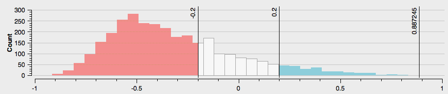
Histogram→Load Values. Now you can see the exact distribution of values over the classes. This is very practical to decide on a classification method. You can also check the mean value and standard deviation.
Optional: In the
Symboldropdown menu you can select the colours and symbols you want to use.Optional: In the
Color rampdropdown menu you can specify the range of colours you want to use. To see all color ramps click on the down arrow of theColor ramp→All Color Ramps.Optional: Under
Legend Formatyou can adjust how precise the range of the classes will be displayed in the legend. Usually, it is practical to not use too complicated numbers in the legend.Optional: You can open the panel
Layer Renderingon the button of the window. Here you can adjust the opacity/ transparency of the layer.Click
Applyto put your adjustment into effect.Click
OKto close the window.
The number of classes #
Deciding on the number of classes, and where the ranges for the different classes lie, has a profound impact on the resulting map.
There are seven ways in QGIS to split quantitative data into classes.
The four most important ones are: Equal intervals, Quantile, Natural breaks, Manual.
In general, you should limit the number of classes between 3 to 9.

Fig. 14 The impact of different class breaks on maps (Source: HeiGIT, adapted from Axis Maps).#