Exercise 2: Analysing Measles Case Data and Population Distribution #
Background #
The Epidemiology Department has shared a line-list of suspected measles cases reported by health districts. Your task in this exercise is to combine this surveillance data with population estimates from WorldPop to identify districts with high measles incidence rates. This will help the response coordination team prioritise vaccination deployments and plan logistics for outreach activities.
Available Data #
In case you did the exercise Creating an overview map of the health system and vaccination coverage, you do not need to download this dataset. If you do this exercise without doing the previous exercise, download all datasets provided by HeiGIT here. and save the folder on your computer and unzip the file.
Dataset name |
Description |
Source |
Download link / note |
|---|---|---|---|
|
QGIS project created in Exercise 1 |
Local project folder |
|
|
Chad administrative boundaries (level 2 – districts) |
OCHA |
|
|
2025 population estimate per grid-cell |
WorldPop |
|
|
Reported measles cases by district (line list) |
Ministry of Health (MoH) Epidemiology Dept. |
Provided for this exercise by HeiGIT |
Tasks
Task 1: Open the Project and Prepare the Workspace
Open the QGIS project created in Exercise 1:
Project → Open… → chad_health_infrastructure.qgz.
Verify that the administrative boundaries and health facility layers load correctly.
If any layers show an error, use the “Re-link missing layers” dialog to correct their file paths.
Now, lets configure the “Project Home” in the browser panel.
In the browser panel on the left, right-click on
Project Home→Set Project Home...and set the project home folder to the training folder (with the subfolders/data,/project, etc.). Now you will be able to access all the datasets for this training through the browser.
Tip
Working with the browser panel allows a much quicker access to the files and keeps the folder view organised when working with shapefiles and multiple layers.
Task 2: Calculate the Population per District #
In order to calculate the incidence rate per district, we first need to know the population in each district. In many humanitarian contexts, there may be no recent or reliable census data available due to conflict, displacement, or limited national statistical capacity. In such cases, we can use WorldPop population estimates to approximate the population per district. WorldPop produces high-resolution gridded population datasets by combining census data, satellite imagery, land cover information, and statistical modelling to predict population distribution. While these estimates are very useful for planning and epidemiological analysis, it is important to remember that they are modelled estimates, not exact counts, and may carry some uncertainty.
Add the WorldPop 2025 raster (
tcd_pop_2025_CN_100m_R2025A_v1.tif) via drag-and-drop or:Layer → Add Layer → Add Raster Layer….Take the time to investigate the new layer. Where is the population concentrated? What is the highest or median cell value? How is raster data different to vector data?
Tip
You can use the Identify Tool
 to click on the raster and see population estimates per pixel.
We will now calculate the total population for each district using the tool
Zonal StatisticsIn the Processing Toolbox, search for “Zonal Statistics” and open the tool.
Set the parameters as follows:
Input layer:
tcd_admbnda_adm2_20250212_ABRaster layer:
tcd_pop_2025_CN_100m_R2025A_v1Raster band: 1 (there will be only one option available)
Ouput column prefix:
population_Statistics to calculate:
Sum
Click
Run.The Result will be a new layer called
Zonal Statistics. This is a temporary layer, indicated by the on the right of the layer name.
Make the layer permanent by right-clicking on it →
Make permanentand give it a name liketcd_pop_2025_adm2.Take a look at the new layer by opening it’s attribute table and looking at the new column.

Apply a graduated classification to visualize the district-level population sum results#
Task 3: Calculate the Population under 5 per District #
Measles disproportionately affects young children, especially those under five, who are more likely to develop severe complications and have higher mortality rates. Knowing the under-5 population per district helps estimate how many children are at greatest risk, plan targeted vaccination campaigns, and assess whether health resources are sufficient to protect the most vulnerable age group (WHO on Measles).
Worldpop data in age and sex structures
WorldPop also provides population estimates by age and sex. This is especially important in our scenario, as we need to know the under-5 population for each district. To find this, go to the Age Structures section and search for Chad.
Can you find and download the WorldPop raster containing the population under 5? For a hint look here. If you scroll down, there is list of the Data Files for the specific age groups.
Add the population under 5 rasters (
tcd_t_00_2025_CN_100m_R2025A_v1.tifandtcd_t_01_2025_CN_100m_R2025A_v1) via drag-and-drop or:Layer → Add Layer → Add Raster Layer….We will now calculate the total population under 5 for each district using the “Zonal Statistics” tool. Repeat the steps from the previous task. Since the under-5 population is split across two input rasters, you will need to run the same procedure twice.
Set the parameters as follows:
Input layer:
tcd_pop_2025_adm2(output from the previous task already containing the total population sum per districts)Raster layer:
tcd_t_00_2025_CN_100m_R2025A_v1Raster band: 1 (there will be only one option available)
Ouput column prefix:
population_under_1_Statistics to calculate:
Sum
Click
Run.Rename the output in the QGIS Layers panel to
tcd_pop_2025_under_1
Repeat this step with the raster
tcd_t_01_2025_CN_100m_R2025A_v1as input raster layer and name the output column prefixpopulation_under_5_. As Input layer, use the “Zonal Statistics” output from the run for the population under 1 renamed totcd_pop_2025_under_1.Rename the output in the QGIS Layers panel to
tcd_pop_2025_under_5and remove thetcd_pop_2025_under_1layer as we don’t need it anymore.
Open the field calculator in the attribute table.
Right-click on the layer and open the attribute table or click on this symbol

In the tool bar of the attribute table, open the
 . The field calculator let’s you enter expression to calculate new columns.
A new window will open. This is the expression builder.
In the expression builder, we can build and test expressions.
In the middle section, we can open the “Fields and values” header to show the columns of the dataset. Uncollapse it and Double-Click on
population_under_1_sumandpopulation_under_5_sum. This will add the column to the expression window on the left.In the expression window
Enter the following expression:
population_under_1_sum + population_under_5_sum
Make sure to give a meaningful “Output field name” such as
total_population_under_5Select the correct “Output field type”

Now remove the fields containing the
population_under_1_sumandpopulation_under_5_suminformation as we don’t need them anymore. Click on “Delete fields” and remove these two columns. Save the layer.
Save the enhanced population layer by right-clicking on it and selecting
Make permament.... Select “Geopackage” as the output format and save the layer to thedata/interim/-folder and enter a file name such astcd_pop_2025_under_5. ClickSave.
Task 4: Import and Explore the Measles Cases List #
Import the
measles_cases_adm2dataset as a delimited text layer with no geometry.In the top bar, navigate to
Layer→Add Layer→Add Delimited Text Layer.... A new window will open.To the right of file name, click on the
 three points and navigate to the file in the
 /data/input/-folder. ClickOpen.In the import window, you will see sample data in the sample data field. Take a look at the columns and data available. What kind of data is present in each column? The measles cases don’t have any geometry information.
Under
Geometry DefinitionselectNo geometry (attribute only table).Check if the sample data displays correctly. Make sure the data type is correct (e.g., cases as integers, not as string).
Click
Add.
Note
As with other data formats, you can drag-and-drop csv-files onto your map canvas and it will be loaded into your project. However, this will lead to mistakes in the data format for each column as it assumes that every column contains text (string) data. You will be unable to perform mathematical or statistical operations with these columns.
Make sure to always load csv data via the data source manager and not via the drag-and-drop function.
Explore the new data file by opening the attribute table.
Right-click on the
measles_cases_adm2-layer and open the attribute table.Take a look at the columns and at how the data is being stored.
How could we use this data in our map?
Task 5: Joining the measles cases with our adm2 layer #
We can join the measles cases with our adm2-layer including the population data (
tcd_pop_2025_under_5):In the processing toolbox, open the “Join Attributes by Field value”-tool
Input layer:
tcd_pop_2025_under_5Table field:
ADM2_FRInput layer 2:
measles_cases_adm2Table field 2:
adm2_nameUnder “Layer 2 fields to copy” select
cases_totalClick
Run.
The result will be a new layer called
Joined layer. Let’s open the attribute table and look at the data.
If everything is correct, let’s make the layer permanent under
tcd_pop_2025_measles_adm2
Task 6: Calculating the incidence rate #
Our district layer now includes the total population, the population under 5 and the total number of measles cases per district. With this information, we can calculate the incidence rate.
Open the field calculator in the attribute table.
Right-click on the layer and open the attribute table
In the tool bar of the attribute table, open the
.A new window will open with the expression builder.
Make sure to give a meaningful “Output field name” such as
measles_incidence_rate
In the expression builder, we can build and test expressions.
In the middle section, we can open the “Fields and values” header to show the columns of the dataset. Uncollapse it and Double-Click on “population_sum”. This will add the column to the expression window on the left.
In the expression window
Enter the following expression:
(cases_total / population_sum ) * 10000
Save the layer and the changes.
Great, we have calculated the incidence rate in our polygon layer. Now, we can create a map displaying the information we gained
Task 7: Creating map of measles incidence rate #
In this task, we will create a map showing the measles incidence rate by district, helping to visualize where the disease burden is highest. We will also add an overview map displaying the population under five, providing important context for understanding the distribution of vulnerable age groups and interpreting the incidence patterns.
Task 7.1: Symbology #
Symbology measles incidence rate
Use the
tcd_pop_2025_measles_adm2layer with the incidence rate from the previous calculationRight-click on the layer and open the symbology tab
Select
Graduatedandmeasles_incidence_rateas the “Value”Color ramp could be
RedsSelect Mode
Equal Intervaland 5 Classes
Symbology population under 5
Use the
tcd_pop_2025_under_5layer with the information of population under 5Right-click on the layer and open the symbology tab
Select
Graduatedandtotal_population_under_5as the “Value”Color ramp could be
TurboSelect Mode
Equal Countand 5 Classes
Task 7.2: Print Layout #
Once you are happy with the symbolization and colors of your data, the next step is to create a print layout. By adding additional information such as a title, data sources, projection, description, etc. you provide your audience with the means to contextualise and evaluate the map and it’s content by themselves.
Open a new print layout and give it a name (e.g. Measles Incidence Chad). A new window will open with a blank canvas and a different set of tools. This is the print layout designer.
On the left, you will find a toolbar with tools to add and move items on the print layout canvas.
On the right you will find a list of items you added to the print layout (it is still empty). Beneath this, you will find a tab called “Item properties”. This is where you modify the items on your print layout (e.g. enter the text for a text box or change the font).
Insert a new map by clicking on
 (
(Add Map) on the left toolbar, and drawing a rectangle on the print canvas. VideoMove and position the map so that the entire country is visible at a reasonable scale. The first map will be used for the measles incidence rate.
For our example we want to add another map. In this overview map we will display the population under 5.
Lock layers and Lock styles for layers
When working with multiple maps in the Print Layout, you need to lock the layers and their styles in the Item Properties under the “Layers” section. This ensures that each map remains unchanged, even if you turn layers on or off in the main QGIS window.
Let’s add a title:
Click on
 (
(Add text)Drag a rectangle on the canvas.
In the item properties window on the right, you will find a text box with the text “Lorem ipsum”. Here you can enter your map title (e.g. Measles Incidence Rate | Chad).
Adjust the font size: Click on the Font dropdown menu and adjust the font size for a title (25p or more). Adjust the text box if necessary.
Let’s add a legend:
Click on
 (
(Add legend).Navigate to the Item Properties panel on the right.
Scroll down a bit and check turn off
Auto Updateby unchecking the check box. Now you can freely edit every item on the legendAdjust the legend by removing unnecessary layers (which are not seen on the map) and rename the layer in the legend by clicking on
 (
(Edit selected item properties) below the legend entries.
Now, let’s add a scale bar:
Click on
 (
(Add Scale bar)Draw a rectangle on the map and position the scale bar on the edge of the map. You can adjust the scale bar units (meters, kilometers, …), the fixed segment width (50 km, 75 km, 100 km, …) and the number of segments (to the right).
Let’s add a north arrow:
Click on
 (
(Add North Arrow).Drag a rectangle on the print layout. Adjust the size and location of the north arrow. You can also change the icon in the item properties.
Add a text box with additional information, sources, the author (you), and date of creation.
When you are happy with your print layout. You can export it as a PDF. You can save it in the project folder under “results”.
Once you have exported the map. Look at the PDF and make sure it looks how you intended. Some things might look different in the PDF. If it does not look correct you may need to make some adjustments in the symbology.
The finished map could look something like this:
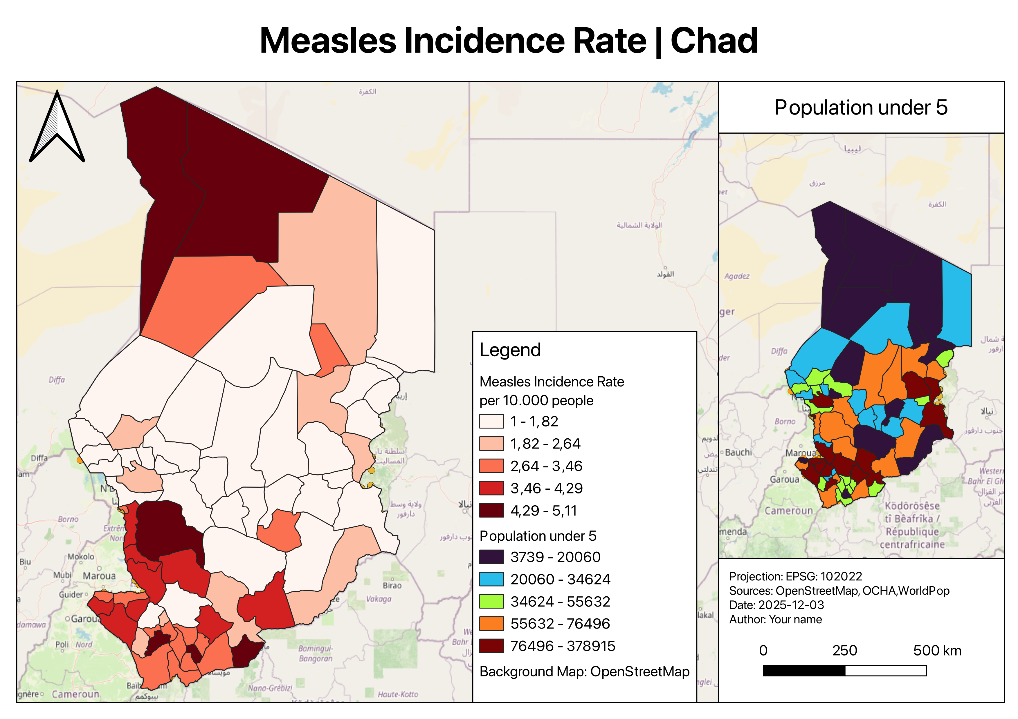
The main map displays the measles incidence rate, while the secondary map shows the population under five.#