Exercise 5: Quick Map Creation - Aina Uses Map Templates #
Characteristics of the exercise #
Type of trainings exercise:
This exercise can be used in online and presence training.
It can be done as a follow-along exercise or individually as a self-study.
Exercise Track:
This exercise is part of the Madagascar Anticipatory Action Cyclon Analysis Exercise Track
Estimated time demand for the exercise
Relevant Wiki Articles
Aim of the exercise:
Aina, the GIS expert at the Malagasy Red Cross (CRM), is preparing for the upcoming cyclone season. She wants to improve her team’s ability to act quickly once a storm is forecasted by automating key analyses in QGIS. These include estimating exposed populations, identifying impacted services like health and education, and assessing whether health posts can be reached from key warehouses within a critical 10-hour window. The goal is to prepare an end-to-end analysis and visualization workflow that can support fast, data-driven anticipatory action before a cyclone makes landfall.
Instructions for the trainers #
Trainers Corner
Prepare the training
Take the time to familiarise yourself with the exercise and the provided material.
Prepare a white-board. It can be either a physical whiteboard, a flip-chart, or a digital whiteboard (e.g. Miro board) where the participants can add their findings and questions.
Before starting the exercise, make sure everybody has installed QGIS and has downloaded and unzipped the data folder.
Check out How to do trainings? for some general tips on training conduction
Conduct the training
Introduction:
Introduce the idea and aim of the exercise.
Provide the download link and make sure everybody has unzipped the folder before beginning the tasks.
Follow-along:
Show and explain each step yourself at least twice and slow enough so everybody can see what you are doing, and follow along in their own QGIS-project.
Make sure that everybody is following along and doing the steps themselves by periodically asking if anybody needs help or if everybody is still following.
Be open and patient to every question or problem that might come up. Your participants are essentially multitasking by paying attention to your instructions and orienting themselves in their own QGIS-project.
Wrap up:
Leave time for any issues or questions concerning the tasks at the end of the exercise.
Leave some time for open questions.
Available data #
Download all datasets here, save the folder on your computer and unzip the file.
Context #
After all the hard work of analyzing data and styling layers, Aina is ready to share her results. But creating a professional-looking map from scratch every time would be slow and repetitive.
To save time, she uses map templates (.qpt files) prepared by her team. These templates already contain the essential elements — map frames, legends, logos, titles, and scale bars. With them, Aina can turn her analysis into a clean, consistent map in just a few clicks.
✅ Goal
Apply a ready-made QGIS map template to quickly create and export maps that show cyclone impacts on population, health facilities, and schools.
Tasks: #
Load the pre-made print layout template
Locate the template
cyclone_impact_population_map_template.qptin your project folder under:
Map_Templates/You can load the template by drag-and-drop:
Open your QGIS project.
Drag the
.qptfile directly into QGIS — a new layout will be created automatically.
Alternatively:
Go to
Project→New Print LayoutEnter a name (e.g.
Harald_2025_population)Click
OKIn the layout, go to
Layout→Import from Template…Select the file
cyclone_impact_overview_map_template.qptand clickOpen
Check and set page size
Right-click anywhere on the white canvas and choose
Page Properties.On the right-side panel, ensure the following:
Page Size: A3
Orientation: Landscape
Update the attribute table of exposed districts
In the Print Layout, click on the attribute table (right-hand side of the layout).
In the Item Properties panel:
Ensure the correct layer is selected
Harald_Exposed_populationClick
Refresh Table DataClick
Attributes…→ in the upper part under Fields click onClearThen add the following layer by clicking on ➕ :
Attribute:
ADM1_EN;ADM2_EN;ADM2_PCODE;exposed_population_sumTo sort the tabel content, under the Sorting clicking on ➕ and add the column
AMD1_ENSort Order: Ascending
Click
OK
⚠️ Warning – Long Tables
If the attribute table you want to include is longer than the map frame, part of it will be cut off in the exported map.
To fix this, open the table properties in the layout and reduce the font size until the full table fits.
Adjust the legend
In the layout, click on the Legend item.
In the Item Properties panel:
Uncheck Auto update
Scroll to Legend items and remove all entries (🗑️)
Add the following relevant layers:
example_Harald_2025_Trackcyclone_harald_bufferHarald_Exposed_Population
When selecting layers, check Only visible layers
Rename legend entries to match layout naming
example_Harald_2025_Track->
Cyclone Harald Track
cyclone_harald_buffer->
Cyclone Harald 200 km Buffer
Harald_Exposed_Population->
Number of exposed peopel
Update Logos and Icons
The logos that need to be added to the map are represented by the red X.
Click on the image in the Item List.
Click on the three dots
 next to the file path.
Browse to the folder
logos_picturesand select the correct logo file.
Review and update layout text elements
Make sure all text elements are up to date, especially:
Map title
Cyclone name and date
Author/Organization (optional)
Adjust font size or alignment if necessary
✅ Final Checklist #
Task |
Done |
|---|---|
Page set to A3 Landscape |
☐ |
Only relevant layer group active |
☐ |
Exposed districts attribute table updated |
☐ |
Legend cleaned and renamed |
☐ |
All text elements updated |
☐ |
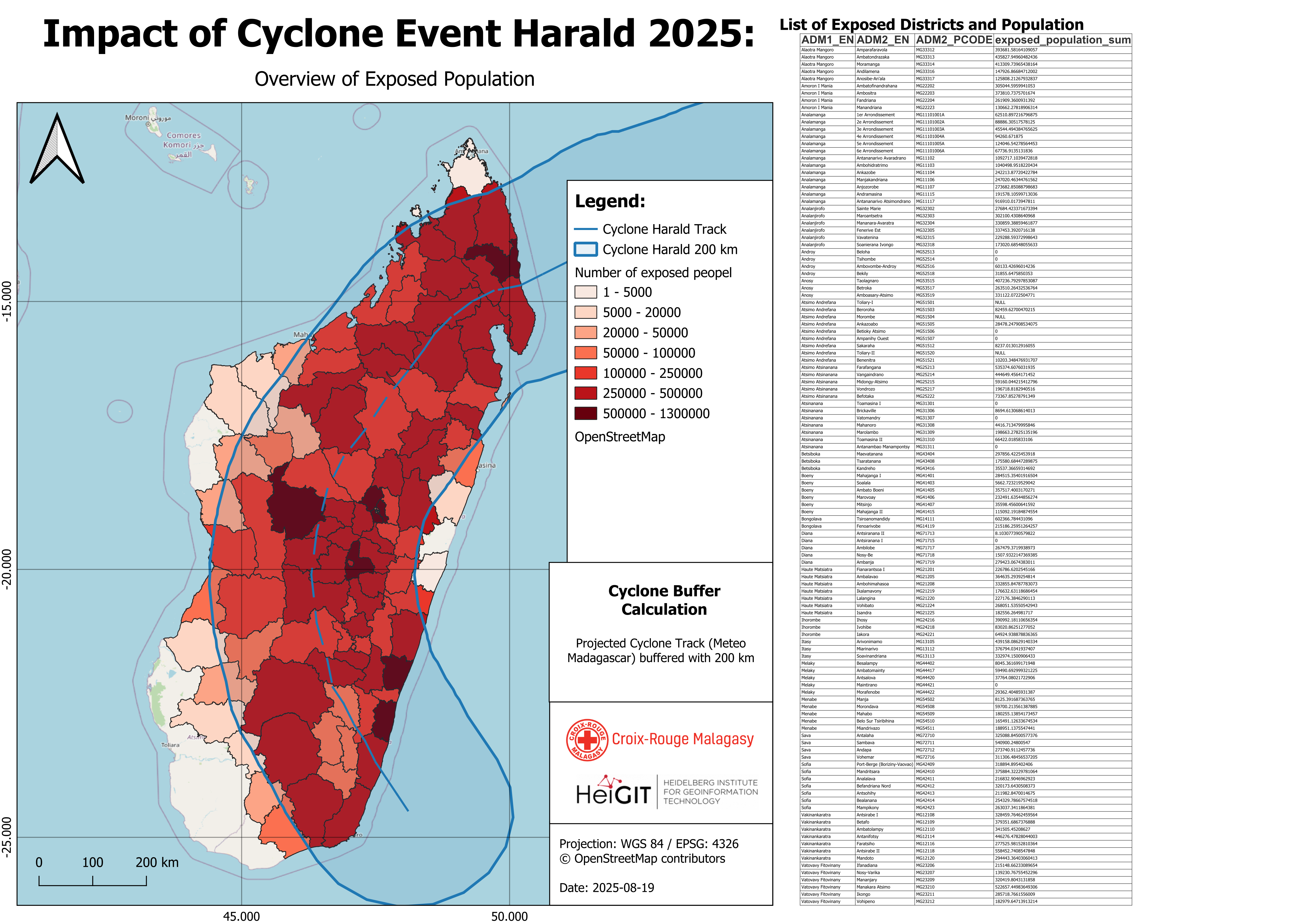
Your final output should look like this after styling the layer
The map now clearly displays the exposed population within the affected districts The original storm track line — used as input data — is highlighted, as well as the buffered impact area, which serves as a proxy for identifying exposed districts.
On the right-hand side of the map, a list shows all exposed districts, including data on total population and exposed population. The districts (Admin 2) are organized under their corresponding regions (Admin 1).