Exercise 4: Visualizing Cyclone Impact Results – Aina Styles Her Layers #
Characteristics of the exercise #
Type of trainings exercise:
This exercise can be used in online and presence training.
It can be done as a follow-along exercise or individually as a self-study.
Exercise Track:
This exercise is part of the Madagascar Anticipatory Action Cyclon Analysis Exercise Track.
Estimated time demand for the exercise
Relevant Wiki Articles
Aim of the exercise:
Aina, the GIS expert at the Malagasy Red Cross (CRM), is preparing for the upcoming cyclone season. She wants to improve her team’s ability to act quickly once a storm is forecasted by automating key analyses in QGIS. These include estimating exposed populations, identifying impacted services like health and education, and assessing whether health posts can be reached from key warehouses within a critical 10-hour window. The goal is to prepare an end-to-end analysis and visualization workflow that can support fast, data-driven anticipatory action before a cyclone makes landfall.
Instructions for the trainers #
Trainers Corner
Prepare the training
Take the time to familiarise yourself with the exercise and the provided material.
Prepare a white-board. It can be either a physical whiteboard, a flip-chart, or a digital whiteboard (e.g. Miro board) where the participants can add their findings and questions.
Before starting the exercise, make sure everybody has installed QGIS and has downloaded and unzipped the data folder.
Check out How to do trainings? for some general tips on conducting trainings.
Conduct the training
Introduction:
Introduce the idea and aim of the exercise.
Provide the download link and make sure everybody has unzipped the folder before beginning the tasks.
Follow-along:
Show and explain each step yourself at least twice and slow enough so everybody can see what you are doing, and follow along in their own QGIS-project.
Make sure that everybody is following along and doing the steps themselves by periodically asking if anybody needs help or if everybody is still following.
Be open and patient to every question or problem that might come up. Your participants are essentially multitasking by paying attention to your instructions and orienting themselves in their own QGIS-project.
Wrap up:
Leave time for any issues or questions concerning the tasks at the end of the exercise.
Leave some time for open questions.
Available data #
Download all datasets here, save the folder on your computer and unzip the file.
Context #
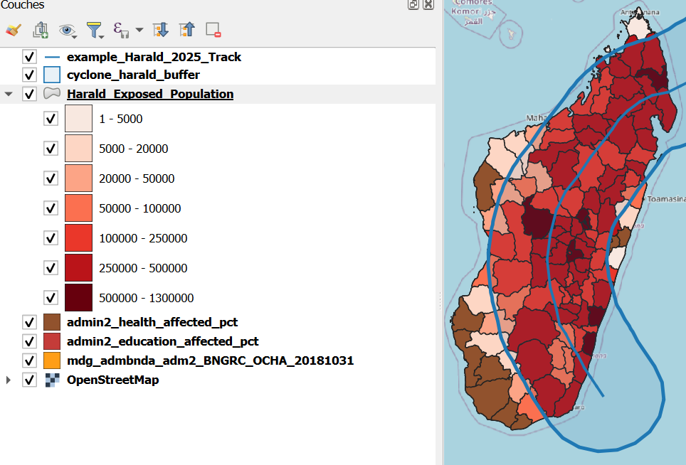
Aina now has all the analysis results she needs — but numbers and tables alone won’t convince her colleagues or decision-makers. What they need are clear and easy-to-read maps that can be used directly in meetings and reports.
To save time, Aina doesn’t want to adjust colors and legends manually each time a new cyclone comes in. Instead, she will use ready-made style files (.qml) that instantly give layers a professional and consistent look. Where no style exists yet, she will create one herself, so that next time the map can be updated with just a few clicks.
In this task, you will help Aina make her cyclone impact maps both informative and visually compelling by applying and creating QGIS style files.
Tasks #
1. Load Required Layers (if not already loaded) #
Make sure the following layers are already loaded into your QGIS project. These are outputs from Task 3:
example_Harald_2025_Trackcyclone_harald_bufferHarald_Exposed_Populationadmin2_health_affectedadmin2_education_affected
If any are missing:
Load them using drag & drop from your
resultsfolder, orUse
Layer→Add Layer→Add Vector LayerorAdd Raster Layer.
2. Apply Predefined Style Files #
Apply the following.qml style files to the respective layers:
Layer |
Style File |
|---|---|
|
|
|
|
|
|
|
|
|
|
Note
⚠️ For the health and education facilities, the provided style files are linked to the column containing the sum of exposed facilities.
They are not based on the percentage column.
Steps:
Right-click on the layer in the Layers Panel.
Select
Properties.In the window that opens, go to the
Symbologytab.At the bottom left, click
Style→Load Style….Click on the three points
 .
.Navigate to the corresponding
.qmlfile in the folderlayer_sytleand select it.Click
Open, thenApplyandOKto confirm.
💡 If the style doesn’t load correctly, double-check the column names and make sure the column name used in the
.qmlfile matches the one in your layer. To do this, open the Attribute Table of the layer and compare field names.
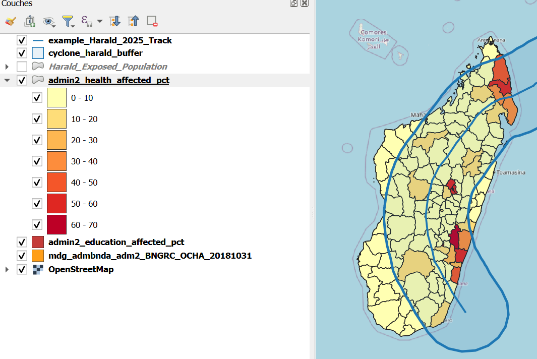
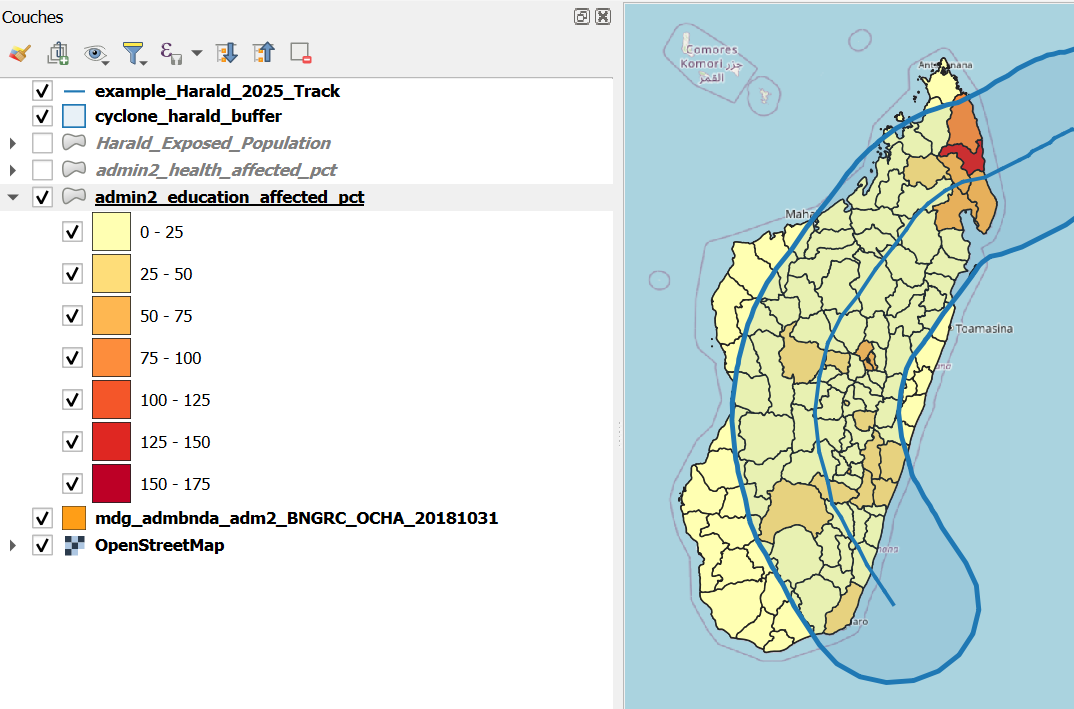
3. Style Percentage Layers Manually #
Aina also wants to visualise the percentage of exposed health and education facilities. However, since there is no prepared style available, she must complete the process manually.
Steps:
Right-click on the layer
admin2_health_affected→ select Duplicate LayerRename the duplicated layer to:
admin2_health_affected_percentageRight-click on the layer in the Layers Panel
Select Properties
In the window that opens, go to the Symbology tab
Set Symbology to
GraduatedChoose the correct field:
pct_health_affected
Open the Histogram tab to view the value distribution by clicking on
calculate histogramNext go back to
Classesand set the following configuration:Mode:
Equal IntervalClasses:
4
Click
OK.This will create four classes (0–25%,25–50%,50–75%,75–100%)Choose a color ramp (e.g., light yellow → dark red)
Optionally customize class labels for clarity
Click
Apply
Repeat the same process for the layer
admin2_education_affected. After duplicating the layer, rename the new one to:
admin2_health_affected_percentage
🧠 Why 4 equal classes?
This helps visualize severity across districts using simple and interpretable risk categories. However, you can experiment with Natural Breaks if data is unevenly distributed.
4. Save Your New Styles for Reuse #
Save your manually created styles as .qml files for future reuse.
Steps:
Right-click on the layer in the Layers Panel
Select Properties
In the window that opens, go to the Symbology tab
Click on
Style→Save Style…Save the file in the folder
layer_styleUse these filenames:
health_pct_affected_styleeducation_pct_affected_style
5. (Optional) Import Styles into Your QGIS Library #
To reuse your styles in any future project:
Go to
Settings→Style Manager.Click
Import/Export→Import Items.Browse to and select your saved
.qmlfiles.
The styles will now appear as presets in the Layer Styling Panel.