Exercise 2: Creating a Flood Situation Map of Larkana, Pakistan #
Larkana flood response exercise track:
This exercise is the fourth part of the Larkana flood response exercise track.
The previous exercise can be found here
Competences covered in this exercise:
Working with multiple layers
Importing SVG libraries
Using SVG markers
Classifying Geodata
Creating a print layout
setting up overview maps
Estimated time demand for the exercise:
The exercise takes around 3 hours to complete, depending on the number of participants and their familiarity with computer systems.
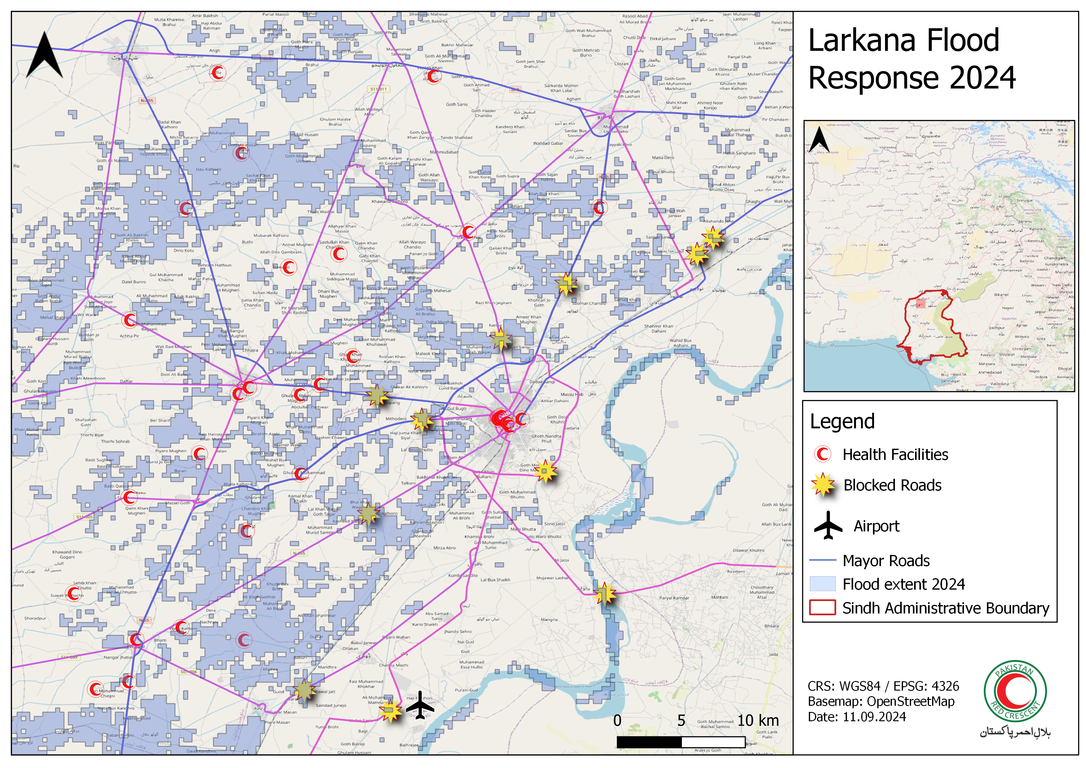
The map we will be making in this exercise (Source: HeiGIT).#
Available Data #
You have created the data for Larkana in Module 3 Exercise 5. In order to conduct this exercise please create a folder on your computer and copy your entire folder structure of Exercise 4 in there.
In case you did not do Module 3 - Exercise 4 you can download the data here. Save the folder on your computer an unzip the file.
Dataset name |
Original title |
Publisher |
Downloaded from |
|---|---|---|---|
Health_Facilities_Flood_2024_AOI.gpkg |
Humanitarian OpenStreetMap Team (HOT) |
HDX |
|
PAK_2024_Minimum_Flood_Extend_reprojected.gpkg |
Satellite detected water extents from 08 to 12 August 2024 over Pakistan) |
UNO SAT |
HDX |
PAK_flood_2024_blocked_road.gpkg |
PAK_flood_2024_blocked_road |
Yourself |
This dataset was created in the previous exercise |
Hint
Folder structure Keep your data management clean by creating a standard folder structure on your computer for your QGIS-projects and geodata.
Task 1: Preparing the Data #
Create a new QGIS-project and save it to your exercise folder. Give it a clear name, e.g. “Larkana_flood_response_map”.
In the Browser panel, Open the
Project Home-folder and navigate to the data subfolder.Import the layers in the folder and import the layers to your QGIS-project:
Healthsites:
Health_Facilities_Flood_2024_AOI.gpkgRoads:
Roads_Larkana.gpkgBlocked Roads Points:
PAK_flood_2024_blocked_road.gpkgFlood Extent 2024 reprojected:
PAK_2024_Minimum_Flood_Extend_reprojected.gpkg
Take a moment to familiarise yourself with the available data. Look into the attribute table of the different layers and look what information is available and how the attributes are named.
-
Navigating to the menu bar →
Layer→Add Layer→Add XYZ-Layer...and add a OpenStreetMap basemap.
Task 2: Symbolisation #
Creating a good map involves selecting appropriate icons and colours to transmit the information in your data. The first step into creating a comprehensible map is to order the layers logically so you can see the information:
In the layers panel:
Put the administrative boundaries layer at the bottom,
put the roads and flood extent layers in the middle,
and put the point layers (healthsites and blocked roads) to the top.
Each layer has it’s own symbology panel where you can adjust the symbology, colours and labels for the features in that layer. Do you need to change some colours? Are the layers ordered in a way that the information is visible? Think about which data we need and what data we can leave out.
For example, the layer Roads_Larkana contains too many roads for a map on a national scale. Let’s open the attribute table and look at how the roads are classified. The data is using the conventional OpenStreetMap classification: The type of road is described under the attribute highway. In our case, it might be useful to only display the primary and secondary roads, so all the features where highway=primary OR highway=secondary.
Let’s go through the layers one by one and visualize them in a meaningful way.
Healthsites: #
In the layers panel, right click on the layer Health_Facilities_Flood_2024_AOI Properties. A new window will open up with a vertical tab section on the left. Navigate to the Symbology tab.
Let’s create our own customized symbol for healthcare facilities:
Under
Symbol layer type, select “SVG Marker”.Scroll down to the SVG-Browser. Here you will find all the folders of your installed SVG-libraries.
Scroll through the folder until you find a suitable symbol (e.g.
 ).
).
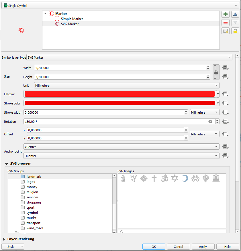
Create customized SVG Marker.#
We can customise the icon further:
On the upper right corner of the symbology tab, click on the
+to add another “Simple Marker”.By default, it will be a circle. Make sure the circle is below the
-symbol by clicking on the  .
.Change the colour of the circle to white.
Click
Apply, thenOK.
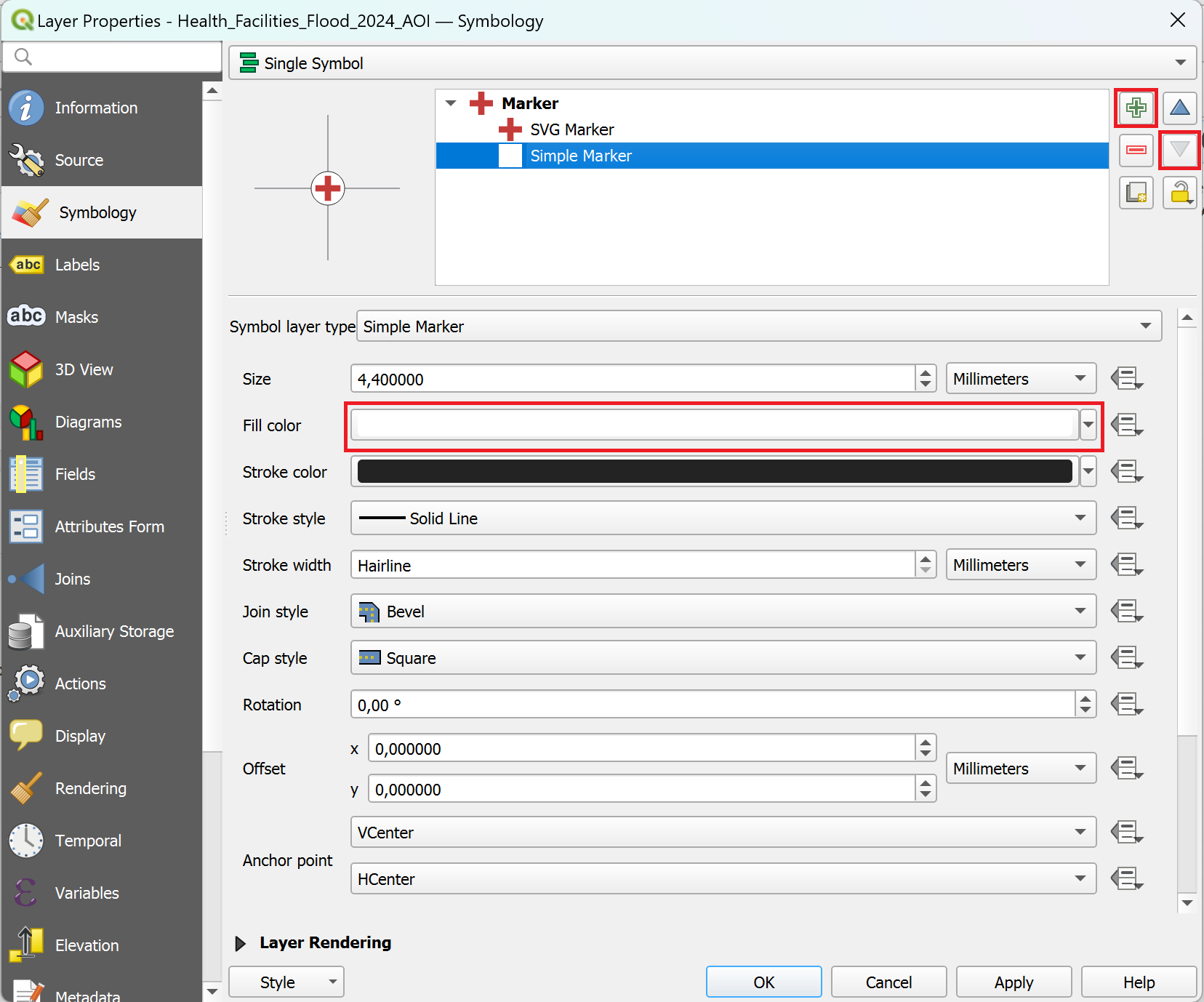
You can use several symbol layers to create a complex symbol in QGIS 3.36.#
Roads: #
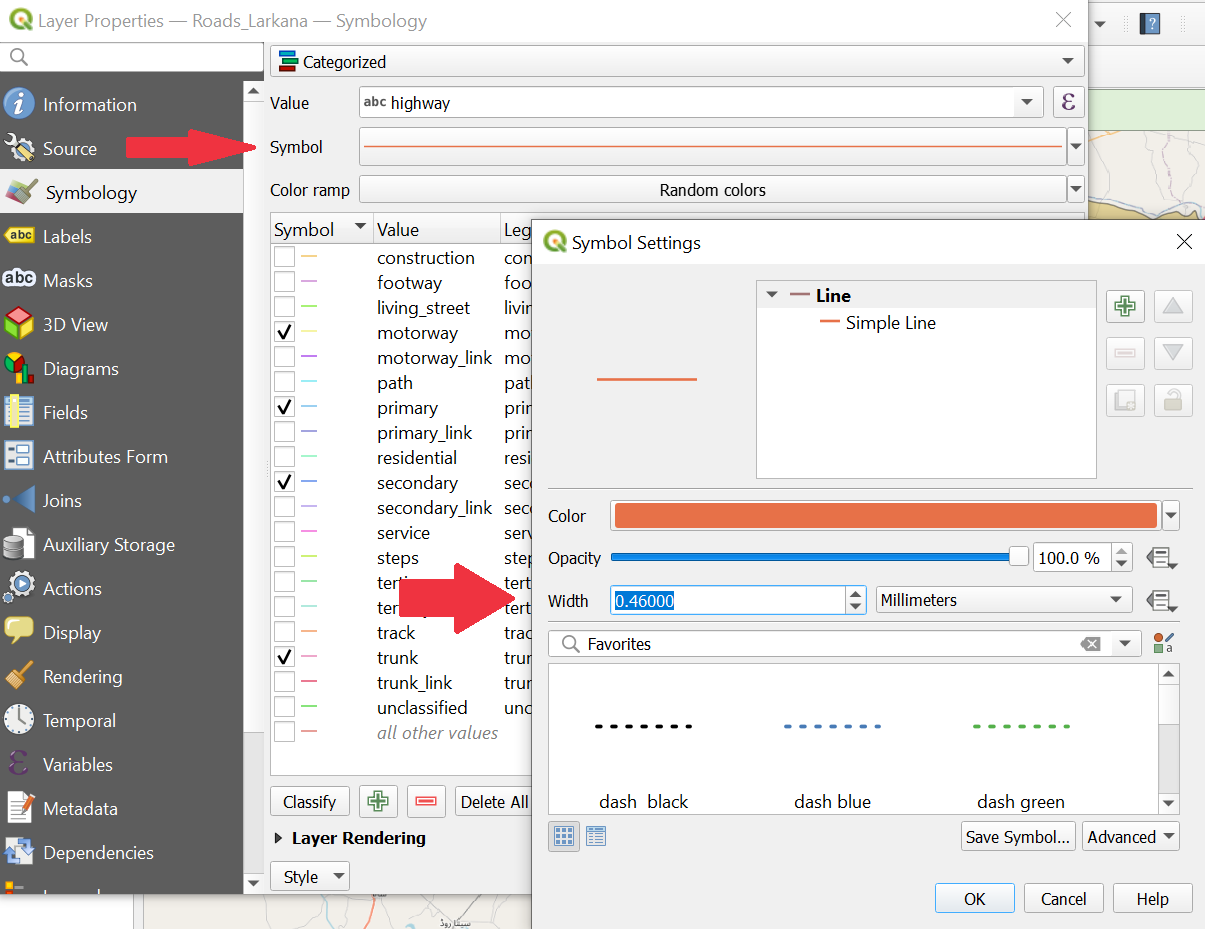
The roads dataset contains a lot of information that we do not necessarily want to display on our final map. We can categorise the data and hide the unwanted information. We already identified the important roads in the previous exercise: The roads where “highway” equals motorway, primary, secondary, trunk. These roads are the major roads.
We can categorise the roads and then select the relevant roads to be displayed. To categorize the roads, double-click on the layer Roads_Larkana. The properties window will open with a vertical tab bar on the left. Navigate to the Symbology tab.
On the top you find a dropdown menu. Open it and choose
Categorized.Under
Valueselect “highway”.Further down the window, click on
Classify. Now you should see all unique values or attributes of the selected “Flood_affected” column. You can adjust the colours by double-clicking on one row in the central field.Remove the tick from all categories except:
motorway,primary,secondary,trunk.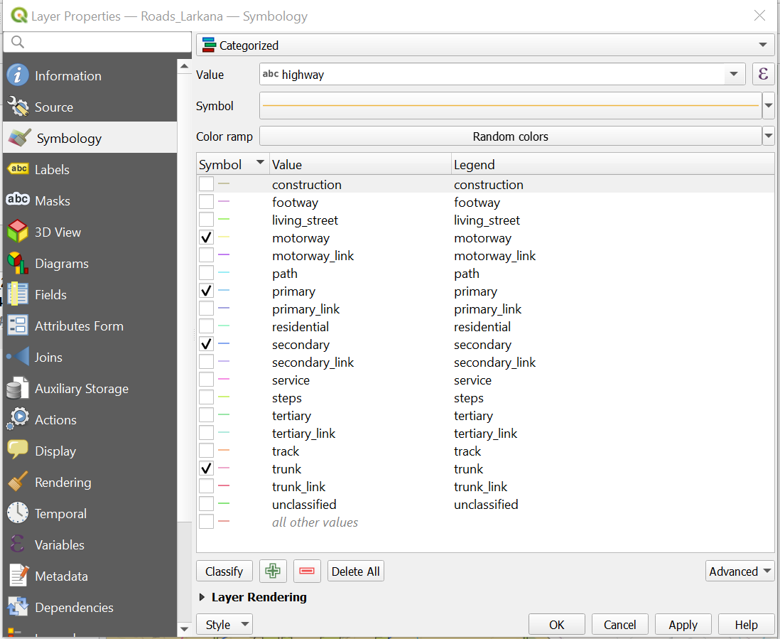
Classifying the roads: By unchecking the boxes you can hide the unnecessary information.#
You have the option to customize the width of the main roads’ lines to improve the visualization. Open the Symbology window, then select ‘Symbol’. In the new window, you can adjust the width of the lines to your preference.
Classifying the roads: You can adjust the width of a single category.#
Once you are done, click
ApplyandOKto close the symbology window.
Blocked Roads Points: #
Right-click on the layer “PAK_flood_2024_blocked_road” in the
Layer Panel→Properties. A new window will open up with a vertical tab section on the left. Navigate to theSymbologytab.Keep the single symbol option. Select any symbol from the list that is appropriate for marking blocked roads.
Once you are done, click
ApplyandOKto close the symbology window.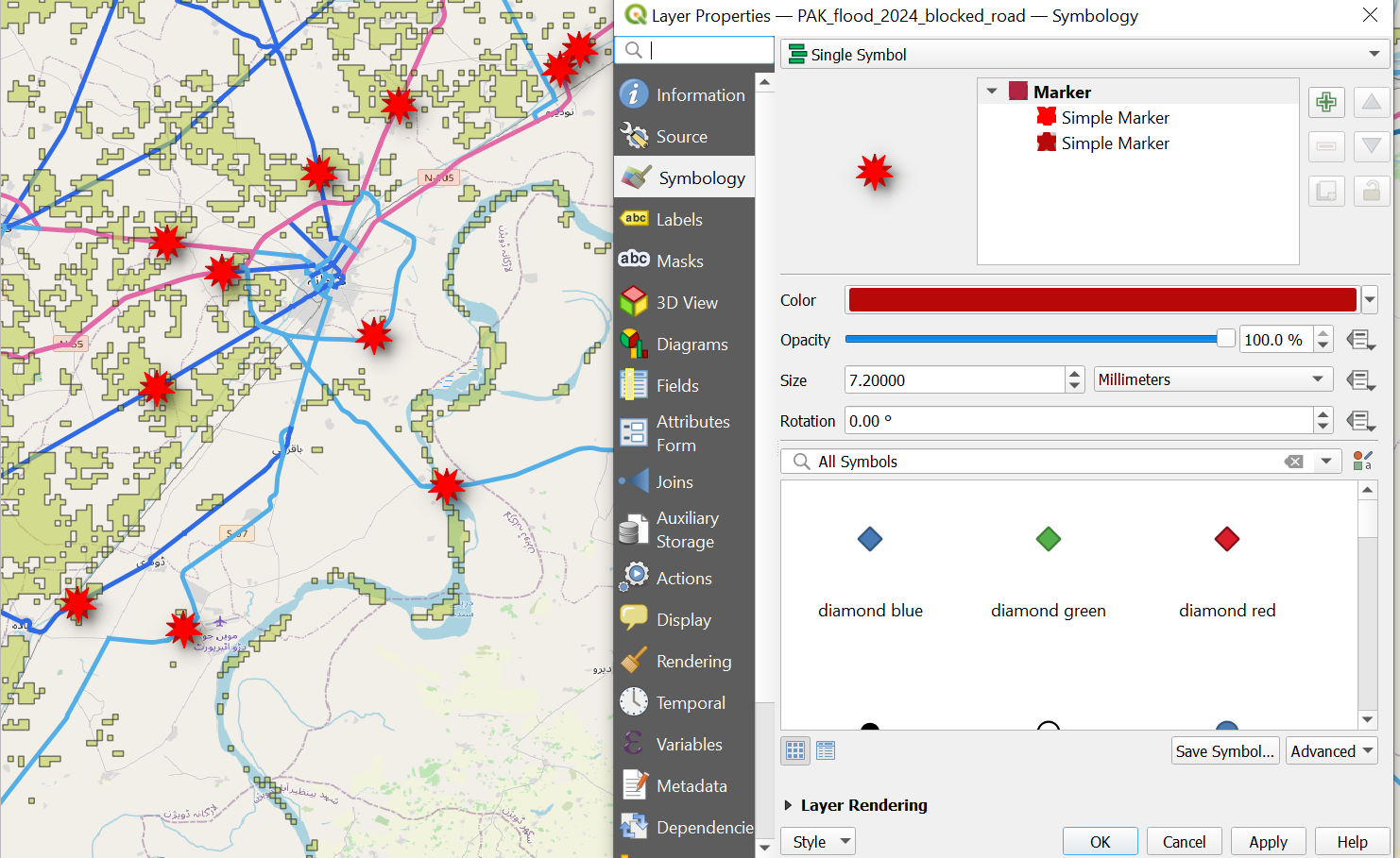
Visualising blocked roads with icons#
Airports: #
In the previous exercise you found out that the Mohenjodaro Airport in the southwest of Larkana City is still accessible via the road network. Essential supplies could potentially be transported from the airport into the city without encountering any roadblocks. We want to point out this possibility. Let’s mark the airport as a point and visualize it!
To do so we will create an entirely new point dataset representing airports.
Click on
Layer→Create Layer→New GeoPackage Layer(Wiki Video)Under
Databaseclick on and navigate to
 tempfolder. Give the new dataset the name “PAK_airports”. ClickSave.Geometry type: SelectPointUnder
Additional dimensionyou should always make sure that you checkNone.Select the coordinate reference system (CRS) “EPSG:4326-WGS 84”. By default, the QGIS selects the project CRS.
Under
New Fieldyou can add columns to the new layer. Add the column “Airport”.Type: SelectText(string)Click on
Add to Fields List to add the new column to the
 Fields List.Click
OK.Your new layer will appear in the
Layer Panel.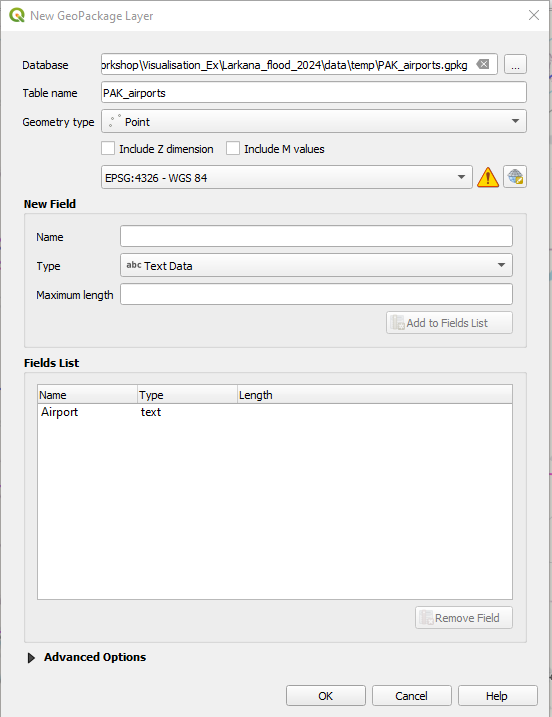
Creating a new point layer for the airports.#
Now you can create a point for the airport and if you would like additional airports as well (wiki). Currently the new layer “PAK_airports” is empty. To add features we can use the
Digitising Toolbar.Look for the Mohenjodaro Airport in Google. Once you have found the airport, click on
 . Left-click on the feature you want to digitise.
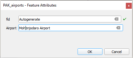
Digitising new point features.#
Once you are done with digitizing click on
 to save your edits.
Click again on
 to end the editing mode.
Let’s symbolise the airport with a plane icon, so we can identify it quickly.
Right-click on the layer “PAK_airports” in the
Layer Panel→Properties. A new window ill open up with a vertical tab section on the left. Navigate to theSymbology-tab.Click on
Simple Marker.Under
Symbol layer type, select SVG-Marker.Scroll down a bit and you will find a box with all the SVG-symbols available.
In the search bar under the box, search for “Plane”.
Select a plane symbol.
Click
Apply, thenOk.
Flood Extent: #
Open the Symbology Tab for the PAK_2024_Minimum_Flood_Extend_reprojected-layer. Choose a light-blue as color and adjust the opacity to about 30%.
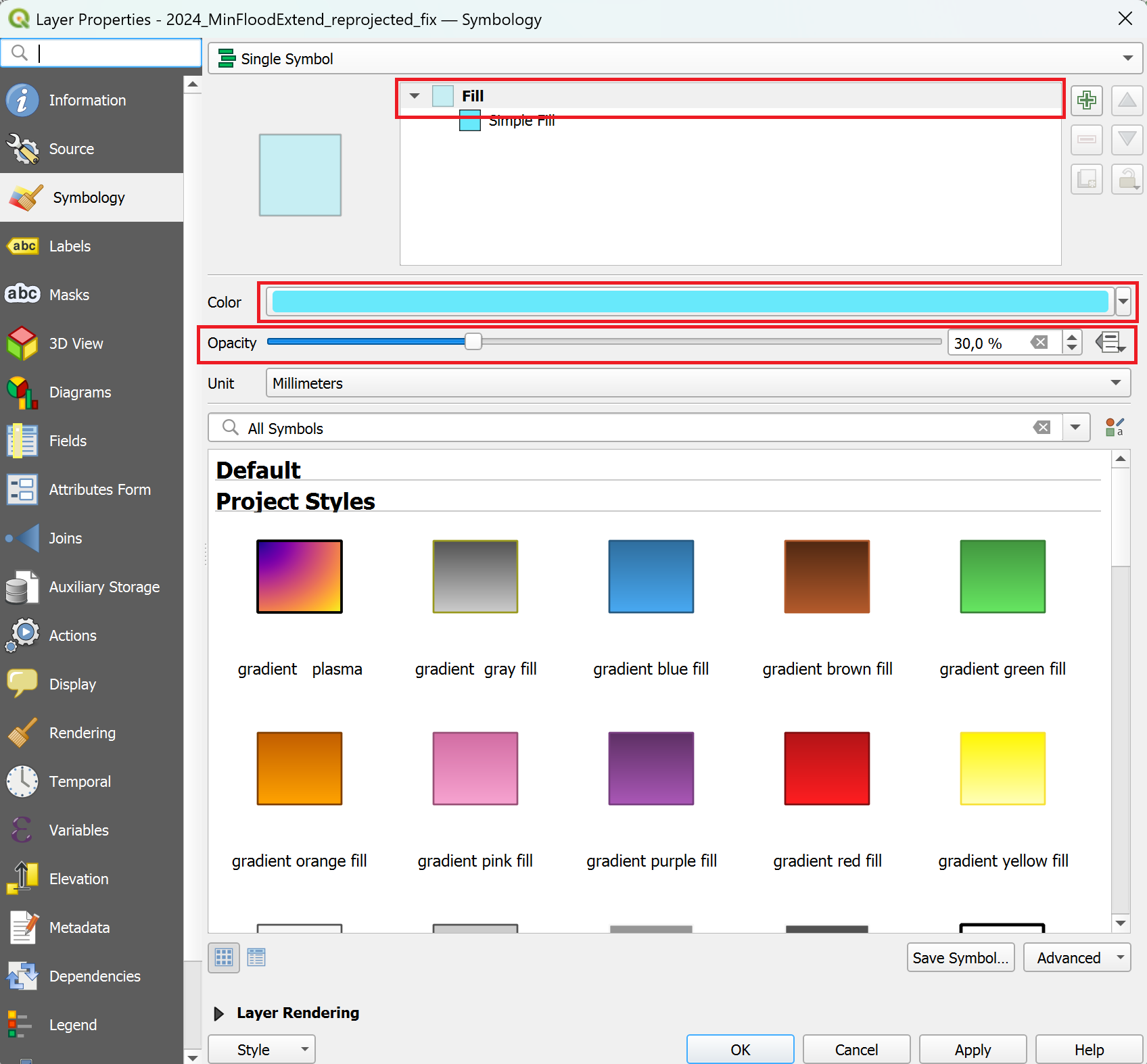
Adjusting the symbology to indicate the flooded area.#
Task 3: Creating the print layout #
Once you are happy with the symbolization and colours of your data, the next step is to create a print layout. The print layout is where you put all the elements from you map together with additional information to create a comprehensive map. By adding additional information such as a title, data sources, projection, description, etc. you provide your audience with the means to contextualise and evaluate the map and it’s content by themselves.
Open a new print layout and give it a name (e.g. Larkana_floods).
Go to
Project→New Print Layout→ enter a name for the new print layout → clickOK.
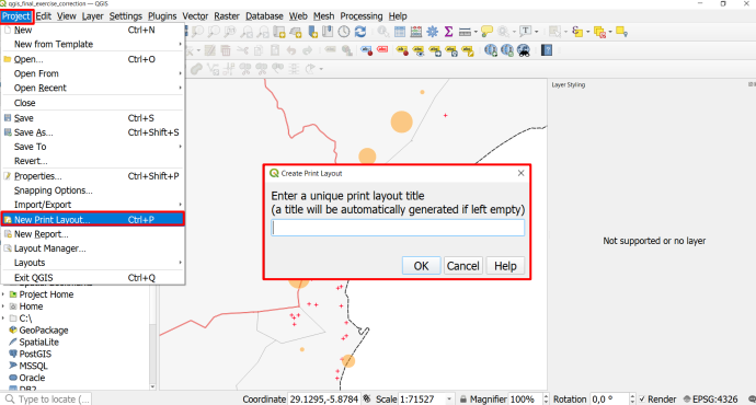
Creating a new print layout.#
A new window with a blank print layout will appear. This is the print layout composer.
On the left, you will find a toolbar with tools to add and move items on the print layout canvas.
On the right you will find a list of items you added to the print layout (it is still empty). Beneath this, you will find a tab called “item properties”. This is where you modify the items on your print layout (e.g. enter the text for a text box or change the font).
Insert a new map by clicking on
 (
(Add Map) on the left toolbar, and drawing a rectangle on the print canvas. Wiki VideoMove and position the map so that the area of interest is visible at a reasonable scale. To move the map content, use the tool
Move item content.
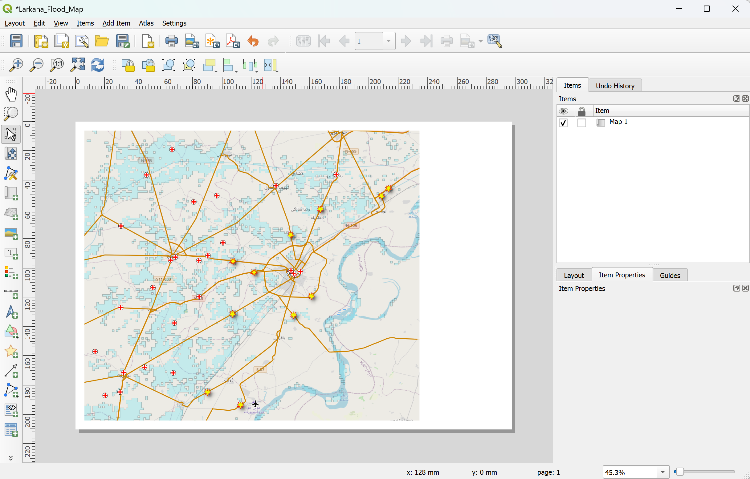
Adding the map to the print layout.#
Let’s add a label for the city of Larkana. This will help your audience that might be unfamiliar with the region orientate themselves.
Click on the
 (
(Add text).Draw a small rectangle next to the city of Larkana.
In the item properties window on the right, you will find a text box with the text “Lorem ipsum”. Enter “Larkana” instead.
Click on the Font dropdown menu and adjust the font size so it can be read easily.
Adding a label for the city of Larkana.#
Let’s add a title:
Click on
(Add text).Drag a rectangle on the canvas.
In the item properties window on the right, you will find a text box with the text “Lorem ipsum”. Here you can enter your map title (e.g. “Larkana, Flood-affected Healthsites and Roads”).
Adjust the font size: Click on the Font dropdown menu and adjust the font size for a title (25p or more). Adjust the text box if necessary.
Below the font dropdown menu, add a little bit of horizontal and vertical margin.
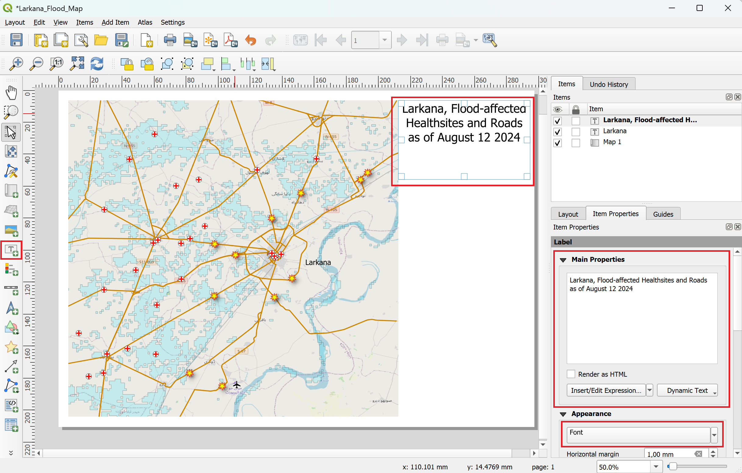
Adding a title to the print layout.#
Let’s add a legend:
Click on
 (
(Add legend).Drag a rectangle on the canvas.
Navigate to the Item Properties panel on the right.
Scroll down a bit and check turn off
Auto Updateby unchecking the check box. Now you can freely edit every item on the legendAdjust the legend by removing unnecessary layers (which are not seen on the map) and rename the layer in the legend by clicking on
 (
(Edit selected item properties) below the legend entries. Use the -icon to add or remove layers from the legend.
Under the upper
Main Properties, insert “Legend” as title.
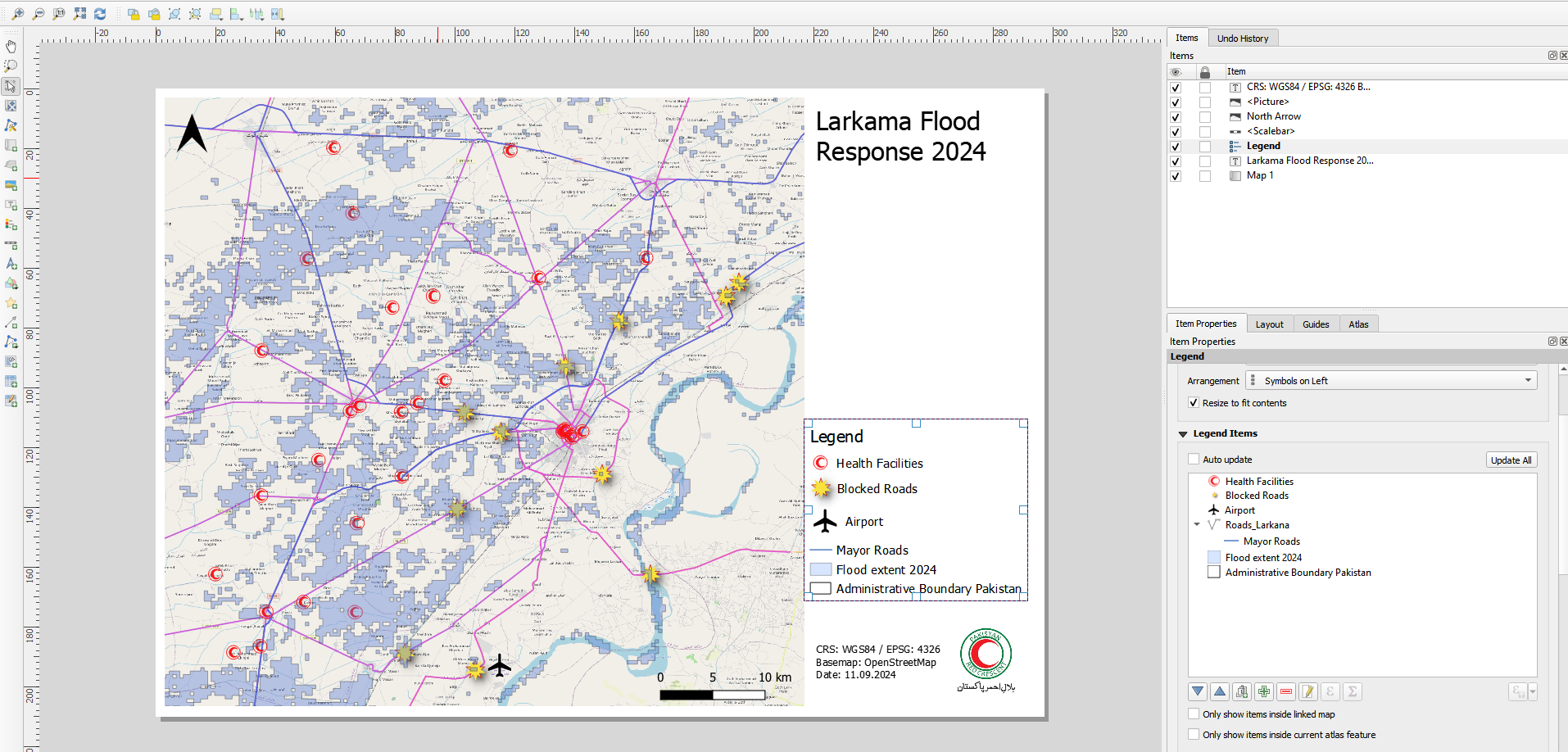
Adjusting the legend.#
Now, let’s add a scale bar:
Click on
 (
(Add Scale bar)Draw a rectangle on the map and position the scale bar on the edge of the map. You can adjust the scale bar units (meters, kilometers, …), the fixed segment width (e.g. 10 km, 20 km, 50 km, …) and the number of segments (to the right).
Let’s add a north arrow:
Click on
 (
(Add North Arrow).Drag a rectangle on the print layout. Adjust the size and location of the north arrow. You can also change the icon in the item properties.
Let’s add a logo (for example, your national society):
Click on
 (
(Add picture).Drag a rectangle in the spot where you want to add the logo.
Navigate to the
Item propertiespanel on the right and switch toRaster image.Click on the three dots
...and select the file with your logo (for this exercise the logo for the Pakistani Red Crescent Society is saved here:/Module_4_Exercise_2_Larkana_flood_map/img/).If necessary, resize or move the picture on the print layout.
Add some additional information in a text box.
Click on
(Add text)Drag a rectangle on the canvas
In the item properties window on the right, you will find a text box with the text “Lorem ipsum”. Here you can enter some additional information of the map, e.g. the coordinate system, basemap information or date.
When you are finished with your map design you can export your printable map as image or pdf under Layout–> Export as Image or Export as PDF.
You could now have as a result a map similar to this one. Here, some space has been left in order to implement an overview map. If you are still have time go for the bonus exercise and add an overview map!
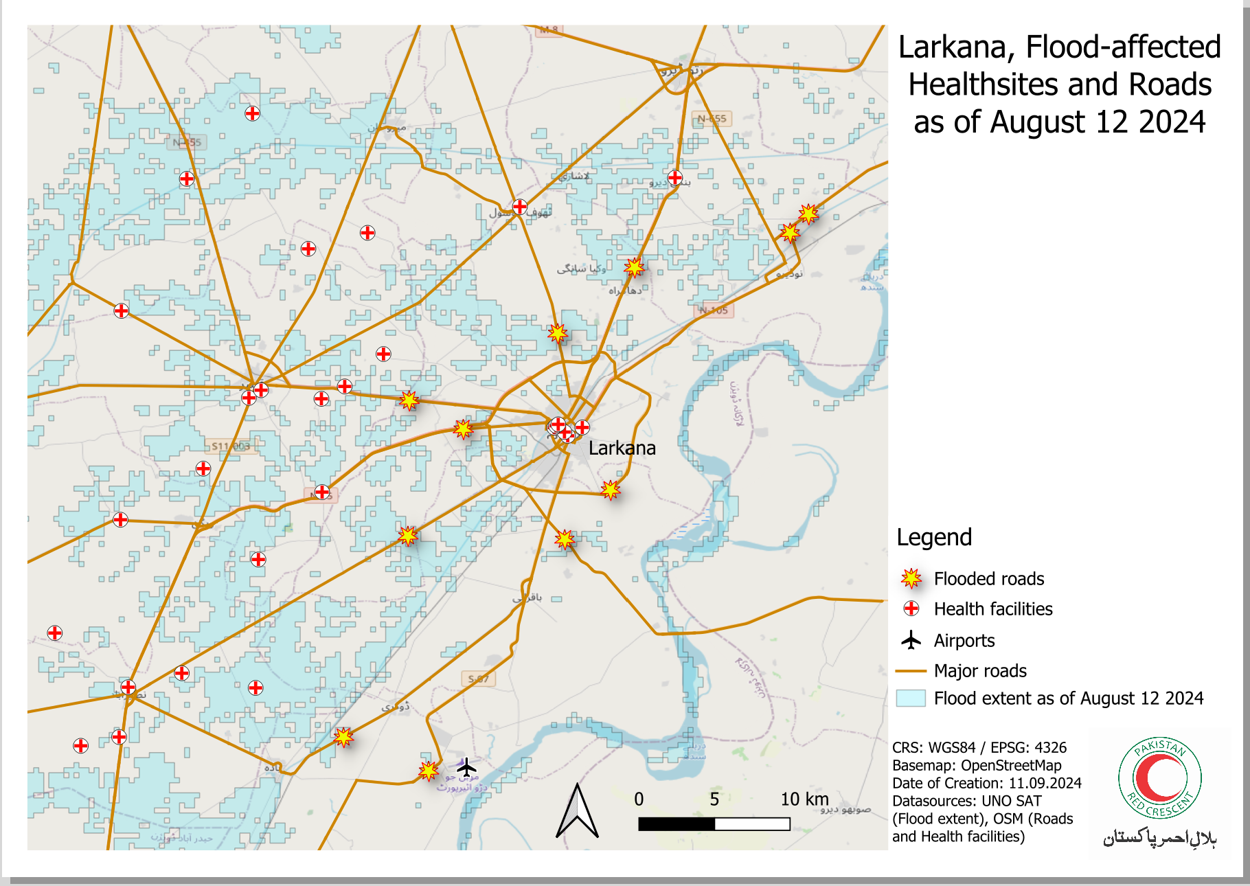
Your final map could look something like this.#
Bonus Exercise #
If you are finished with the main map, click on the map and navigate to the item properties. In the layer section, check the box Lock Layers and Lock styles for layers. This means that if you change the map in the main QGIS-window, the first map you have added to the print layout will not be affected by these changes. Now you can start working on an overview map. We will be using a shapefile with the administrative boundaries of Pakistan.
Return to the main QGIS window. Navigate to the folder
Module_4_Exerise_2_Larkana_flood_map/data/Bonus_exercise/and load the layerPAK_admbnda_adm0_wfp_20220909into your QGIS-project.In the Layer panel, make the layers for the main map invisible by clicking on the
 next to the layer name.
Style the country boundary (ADM0) in a neutral, unobtrusive color. For example, you can use the “Gray 3 Fill” from the styling templates.
Once you are happy with the styling of your overview map, navigate back to the Print Layout window.
Add a second map and position it in a corner.
In the Item properties panel for the second Map (”Map 2”), scroll down and open the
Overview-options.Click on the
+-button to add a new overview.In the “Map Frame”-option, select “Map 1”. This will show the frame of the main map on your overview map.
You can add a scale bar and a northj arrow to your overview map as well.
The finished map could look something like this (Source: HeiGIT).#
Congratulations! You have created a finished map that is ready to be printed and distributed.