Map design Exercise : Creating a Map of Pakistan#
Aim of the exercise:
Participants will work with multiple layers and conduct spatial queries. Additionally, they will learn how to create their own geodata.
Type of trainings exercise:
This exercise can be used in online and presence training.
These skills are relevant for:
QGIS Essentials
Working with multiple layers
Conduct spatial queries
Creation of geodata
Estimated time demand for the exercise:
The exercise takes around 3 hours to complete, depending on the number of participants and their familiarity with computer systems.
Context:
In 2024, the provinces of Punjab, Sindh, and Balochistan in Pakistan experienced devastating floods due to intense and prolonged rainfall. You have already conducted an analysis utilizing actual data from this natural disaster. We now want to visualize our findings on an appealing map that can be printed out or shared with different stakeholders. The map will show specific medical centers and healthcare facilities that where impacted by the flooding. Additionally, we will visualize the viability of road access to the city of Larkana throughout the flood period.
Available Data#
You have created the data for Larkana in Module 3, Exercise 4. In order to conduct this exercise please create a folder on your computer and copy your entire folder structure of Exercise 4 in there. In case you did not do Module 3 - Exercise 4 you can download the data here. Save the folder on your computer an unzip the file.
Dataset name |
Original title |
Publisher |
Download from |
|---|---|---|---|
PAK_adm2_Sindh.gpkg |
UN OCHA |
HDX |
|
PAK_Sind_Health_Facilities.gpkg |
Humanitarian OpenStreetMap Team (HOT) |
HDX |
|
VIIRS_20240721_20240803_MinimumFloodExtent_PAK.shp |
Satellite detected water extents from 08 to 12 August 2024 over Pakistan) |
UNO SAT |
HDX |
Hint
Folder structure Keep your data management clean by creating a folder structure on your computer for your QGIS-projects and geodata. The exercise data should be saved in a location where you can easily find them and the corresponding QGIS-project
Tasks#
Preparation of the data#
Load all necessary the files into a new QGIS-project:
Healthsites:
Health_Facilities_Flood_2024_AOI.gpkgRoads:
Roads_Larkana.gpkgBlocked Roads Points:
PAK_flood_2024_blocked_road.gpkgFlood Extent 2024 reprojected:
PAK_2024_Minimum_Flood_Extend_reprojected.gpkgAdministrative Boundaries Sindh:
PAK_Sindh_adm1.shp
Save your project and give it a clear name, e.g. “Larkana_flood_response”
Look into the attribute table of the different layers and look what information is available and how the attributes are named.
We want to make a comprehensible map, think about which data we need and what data we can leave out.
For example, the layer
Roads_Larkanacontains too many roads for a map on a national scale. Let’s open the attribute table and look at how the roads are classified. The data is using the conventional OpenStreetMap classification: The type of road is described under the attributehighway. In our case, it might be useful to only display the primary and secondary roads, so all the features wherehighway=primaryORhighway=secondary.
Part 1: Symbolization#
Now we have assigned a symbol for each layer at our disposal. Look at the map you created and decide if you want to adjust any symbology to make the map easier to read. Do you need to change some colours? Are the layers ordered in a way that the information is visible? Is the font size appropriate, or does it cover up too much information? Let’s go through the layers one by one and visualize them in a meaningful way.
Healthsites:
Double-click on the point next to your healthsites vector layer. The symbology window will open. Let’s create our own customized symbol for healthcare facilities.
Under
Symbol layer type, select “SVG Marker”Scroll down to the SVG-Browser. Here you will find all the folder of your installed SVG-libraries.
Under
landmarkyou will find the crescent moon, click on it.
Create customized SVG Marker#
you can adjust its color and size and rotate it 180° in order to turn it around.
on the upper right click on the + in order to add another “Simple Marker”. Choose a circle and adjust its color and size in order to fit around the crescent moon.
Another option to use IFRC and Red Cross logos is to use the Plugin Resource Sharing:
With the plugin “Plugin Resource Sharing”, you can install symbol and icon libraries used by the Red Cross and UN, as well as other useful symbols.
Install the “Plugin Resource Sharing” by opening the plugin installation window and searching for the plugin.
Once installed, open the plugin interface by clicking on
plugin>Plugin Resource SharingSearch for packages by the Red Cross and UN
Install the packages.
Now the symbols should be available in the styling manager in the SVG folder.
Roads:
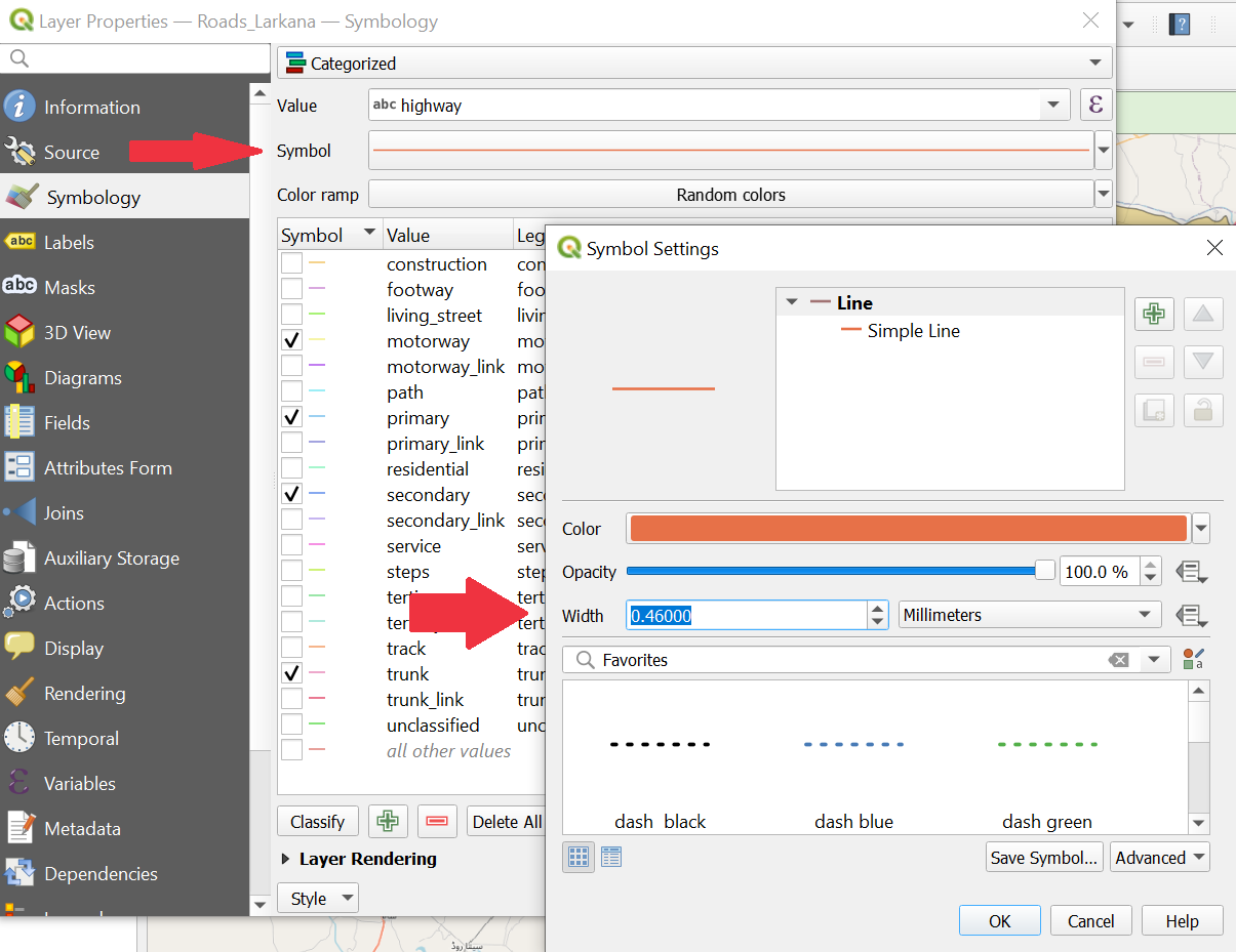
For categorized classification of the roads right-click on the layer Roads_Larkana in the Layer Panel -> Properties. A new window will open up with a vertical tab section on the left. Navigate to the Symbology tab.
On the top you find a dropdown menu. Open it and choose
Categorized. UnderValueselect “highway”.Further down the window, click on
Classify. Now you should see all unique values or attributes of the selected “Flood_affected” column. You can adjust the colours by double-clicking on one row in the central field.Remove the tick from all categories except:
motorway,primary,secondary,trunkPakistan road classification#
You have the option to customize the width of the main roads’ lines to improve the visualization. Open the Symbology window, then select ‘Symbol’. In the new window, you can adjust the width of the lines to your preference.

Pakistan road classification#
Once you are done, click
ApplyandOKto close the symbology window.
Blocked Roads Points:
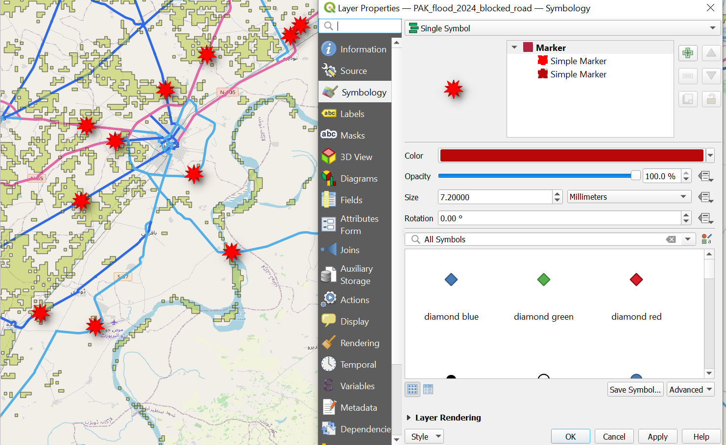
Open the Symbology Tab for the PAK_flood_2024_blocked_road-layer and choose a meaningful symbol for flood related blocked roads.
Airports:
In the previous exercise you found out that the Mohenjodaro Airport in the southwest of Larkana City is still accessible via the road network. Essential supplies could potentially be transported from the airport into the city without encountering any roadblocks. We want to point out this possibility. Let’s mark the airport as a point and visualize it!
To do so we will create an entirely new point dataset representing airports.
Click on
Layer–>Create Layer->New GeoPackage Layer(Wiki Video)Under
Databaseclick on and navigate to
 tempfolder. Give the new dataset the name “PAK_airports”. ClickSave.Geometry type: SelectPointUnder
Additional dimensionyou should always make sure that you checkNone.Select the coordinate reference system (CRS) “EPSG:4326-WGS 84”. By default, the QGIS selects the project CRS.
Under
New Fieldyou can add columns to the new layer. Add the column “Airport”.Type: SelectText DataClick on
Add to Fields List to add the new column to the
 Fields List.Click
OK.Your new layer will appear in the
Layer PanelDigitising airports#
Now you can create a point for the airport and if you would like additional airports as well wiki. Currently the new layer “PAK_airports” is empty. To add features we can use the
Digitizing Toolbar. If you cannot see the toolbarView->Toolbarsand checkDigitizing Toolbar(Wiki Video).
Once you have found the airport, click on it
 . Left-click on the feature you want to digitise.
Once you click on a place, a window will appear. Indicate that the road is blocked by writing
Yesin the fieldBlocked_road.Digitising airports#
Once you are done with digitizing click on
 to save your edits.
Click again on
 to end the editing mode.
Now we can use an icon instead of just a point to display the layer “PAK_airports” to visualise this fact better.
Right-click on the layer__“PAK_flood_2024_blocked_road”__in the
Layer Panel->Properties. A new window will open up with a vertical tab section on the left. Navigate to theSymbologytab.Keep the single symbol option. Select any symbol from the list that is appropriate for marking blocked roads.
Once you are done, click
ApplyandOKto close the symbology window.
Visualising blocked roads with icons#
Flood Extent:
Open the Symbology Tab for the PAK_2024_Minimum_Flood_Extend_reprojected-layer. Choose a light-blue as color and adjust the opacity to about 30%.
Administrative Boundaries:
Open the Symbology Tab for the PAK_Sindh_amd1-layer. Click on Simple Fill and adjust the Symbol layer type to Simple Line. You can furthermore adjust now the outline colour and stroke width.
Bonus Step: Adding a basemap can help potential readers orienting themselves.
If you are happy with the symobolisation of your layers, the map should be ready for a print layout.
Attention
Remember the layer concept and place all layers in a logic order. The flood extents should lay under the roads and the several point layer above the roads.
Part 2: Creating the print layout#
Once you are happy with the symbolization and colours of your data, the next step is to create a print layout. By adding additional information such as a title, data sources, projection, description, etc. you provide your audience with the means to contextualise and evaluate the map and it’s content by themselves.
Open a new print layout and give it a name (e.g. Larkana_floods).
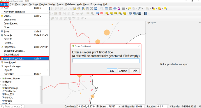
Go to Project > New Print Layout > enter a name for the new print layout > click OK

Create a new Print Layout#
A new window with a blank print layout will appear. This is the print layout designer.
On the left, you will find a toolbar with tools to add and move items on the print layout canvas.
On the right you will find a list of items you added to the print layout (it is still empty). Beneath this, you will find a tab called “item properties”. This is where you modify the items on your print layout (e.g. enter the text for a text box or change the font).
Insert a new map by clicking on
 (
(Add Map) on the left toolbar, and drawing a rectangle on the print canvas. VideoMove and position the map so that the area of interest is visible at a reasonable scale.
Let’s add a title:
Click on
 (
(Add text)Drag a rectangle on the canvas
In the item properties window on the right, you will find a text box with the text “Lorem ipsum”. Here you can enter your map title (e.g. Larkama Flood Response 2024).
Adjust the font size: Click on the Font dropdown menu and adjust the font size for a title (25p or more). Adjust the text box if necessary.
Let’s add a legend:
Click on
 (
(Add legend).Navigate to the Item Properties panel on the right.
Scroll down a bit and check turn off
Auto Updateby unchecking the check box. Now you can freely edit every item on the legendAdjust the legend by removing unnecessary layers (which are not seen on the map) and rename the layer in the legend by clicking on
 (
(Edit selected item properties) below the legend entries.Under the upper
Main Properties, insert “Legend” as title
Create a new Print Layout#
Now, let’s add a scale bar:
Click on
 (
(Add Scale bar)Draw a rectangle on the map and position the scale bar on the edge of the map. You can adjust the scale bar units (meters, kilometers, …), the fixed segment width (50 km, 75 km, 100 km, …) and the number of segments (to the right).
Let’s add a north arrow:
Click on
 (
(Add North Arrow).Drag a rectangle on the print layout. Adjust the size and location of the north arrow. You can also change the icon in the item properties.
Let’s add a logo (for example, your national society):
Click on
 (
(Add picture)Drag a rectangle in the spot where you want to add the logo
Navigate to the
Item propertiespanel on the right and switch toRaster image.Click on the three dots
...and select the file with your logoIf necessary, resize or move the picture on the print layout.
Add some additional information as text.
Click on
 (
(Add text)Drag a rectangle on the canvas
In the item properties window on the right, you will find a text box with the text “Lorem ipsum”. Here you can enter some additional information of the map, e.g. the coordinate system, basemap information or date.
When you are finished with your map design you can export your printable map as image or pdf under Layout–> Export as Image or Export as PDF
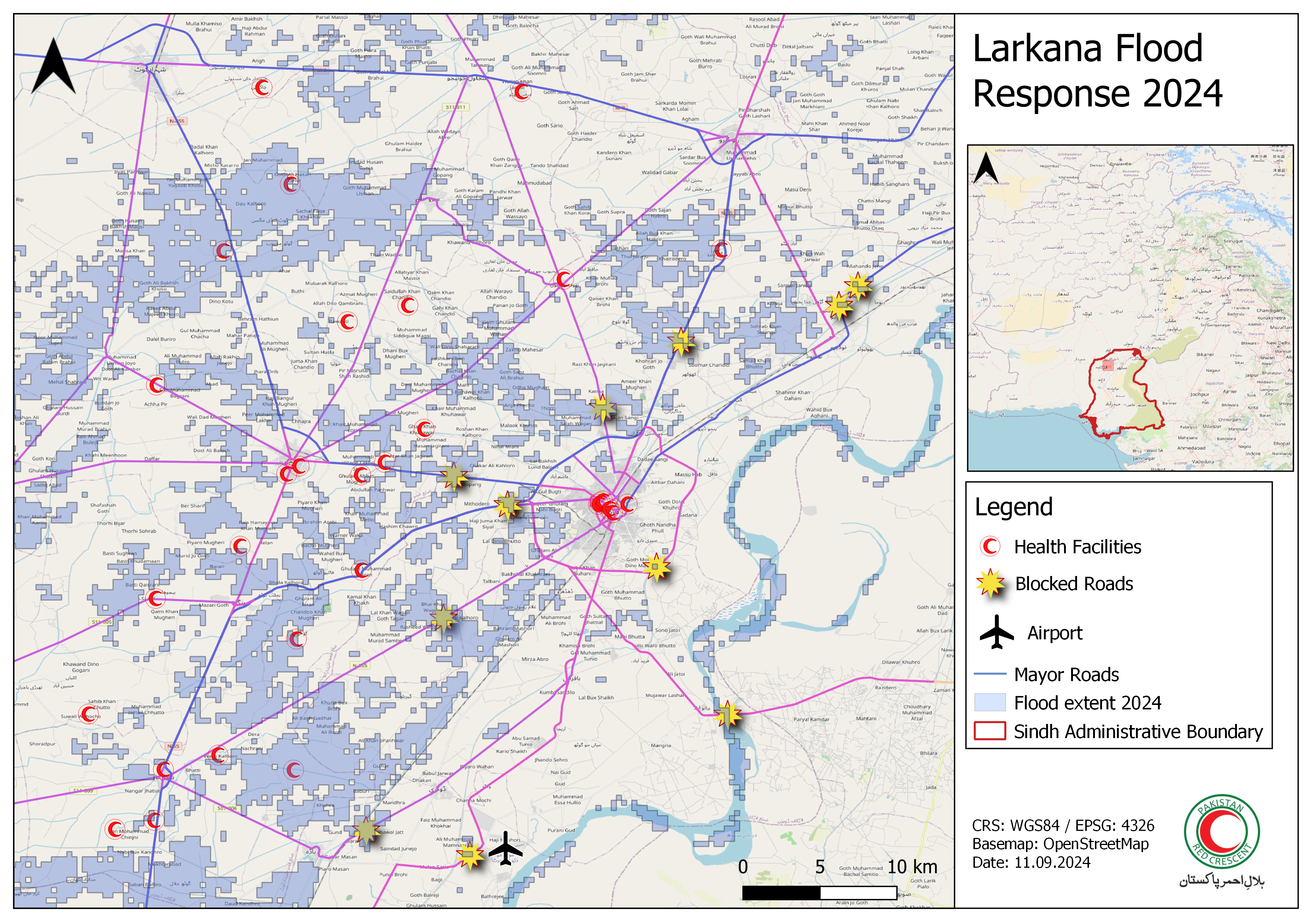
You could now have as a result a map similar to this one. Here, some space has been left in order to implement an overview map. If you are still have time go for the bonus exercise and add an overview map!
Map Larkama#
Bonus Exercise!#
If you are finished with the main map, click on the map and navigate to the item properties. In the layer section, check the box Lock Layers and Lock styles for layers. This means that if you change the map in the main QGIS-window, the map you have added to the Now you can start working on an overview map. We will be using a shapefile with the administrative boundaries of Pakistan.
Return to the main QGIS window and load the layers from the
Bonus Exercise-folder.In the Layer panel, make the layers for the main map invisible by clicking on the
 next to the layer name.
Style the countries in an neutral, unobtrusive color. For example, you can use the “Gray 3 Fill” from the styling templates.
Once you are happy with the styling of your overview map, navigate back to the Print Layout window.
Add a second map and position it in a corner.
In the Item properties panel for the second Map (”Map 2”), scroll down and open the
Overview-options.Click on the
+-button to add a new overview.In the “Map Frame”-option, select “Map 1”. This will show the frame of the main map on your overview map.
You can add a scale bar and a northj arrow to your overview map as well.

Map Larkama#
Congratulations! You have finished your first map.